It’s time for another look behind the INTERLUDE curtain, my friends! Last week, I showed you the secret origin of the photo of the Golden Gate Bridge that will appear behind Admiral Slater for about 20 seconds at the end of the fan film. This week, I’m going to shine the spotlight on how we came up with the ship’s logo for the USS Artemis. The process was much more involved than I thought it would be!
Our story begins over a year ago before Interlude was ever going to be a fan FILM and was simply going to be a fan COMIC BOOK. It was time for my illustrator, the amazingly talented DANIEL FU, to draw Captain Imari Jakande of the USS Artemis for the first time, and he needed to know what kind of insignia to put on his chest.
Hmmm…
By this point, three of the Ares-class starships had logos designed for them: Ajax, Ares, and Hercules:
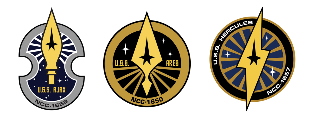
They each featured some kind of weapon (I consider a lightning bolt thrown by a super-strong demi-god to be a weapon). So what kind of weapon was Artemis known for? Well, as goddess of the hunt, she was often depicted with a bow and arrow. The problem was, bows and arrows are very thin and don’t typically have enough room to fit a command star symbol in the center…let alone a sciences planet or an engineering comet.
But Daniel did a little research to discover that Artemis was also the goddess of the moon. Sure, the moon isn’t a weapon (usually), but it’s still a nice celestial outer space thingie. So I gave Daniel a green light to do a moonish insignia. Here’s what he came up with:
As I said, this was long before Interlude the fan film became a possibility. But once it did, I realized that we were going to need an insignia for the USS Artemis tunics in the film…and suddenly there was a problem again. (Isn’t there always in these blogs?)
My first choice would certainly have been to keep the insignia that Daniel drew, as the precedent was now set. Unfortunately, his logo wasn’t practical, as the little “asterisk” star was completely separate from the other elements, and I wasn’t certain a patch-maker could manufacture a two-piece patch if one of the pieces was so tiny. Also, I wasn’t sure what sewing challenges there would be having to place and stitch such a small element properly next to the larger piece. And finally, I wasn’t sure if there would be a higher cost to have such an irregularly shaped patch.
Wanting to play it safe, I created a similar design that still had a crescent moon shape and a star but on a standard circle shape. I thought it was pretty decent…
I was particularly intrigued by the concept of reversing the usual black-star-on-gold-background that was seen on insignia of that Trek era with a gold-on-black approach. I also liked the crescent moon being a third color, which I assumed would be silver.
Of course, before this could be finalized, I needed to get approval from ALEC PETERS. Now, before anyone says, “Hey, wait, isn’t this your fan film, Jonathan? Why do you need to get approval from Alec?”…let me state that my decision in this matter was made as a courtesy and out of respect for Alec. Alec is my friend, and he has poured his heart and soul into creating and nurturing the Axanar Universe for nearly a decade now. I have always seen Interlude as playing in his corner of the Star Trek sandbox, and I want to be consistent with what Alec is doing with the Axanar sequels. And even though the USS Artemis won’t be appearing in his fan film, it is still a part of the universe that Alec is creating. So I asked him for his blessing on the design.
You probably know what’s coming. Had Alec said, “Sure, looks great!” then I probably wouldn’t be blogging about all of this. Instead, I got this response…
I explained about Artemis also being the goddess of the moon, but Alec felt that we really needed to show a weapon in order to be consistent with the other ships in the class. And his preference was for a bow and arrow…the very thing I didn’t think was possible. So it was now time to do the impossible! I took another pass at it.
My designer’s mind thought about that crescent moon, which I still really liked. What if it could double as a bow, as well? And then I could potentially use the command star as an “arrow” nocked and ready to shoot. At this point, it still wasn’t decided—for Axanar and Interlude—whether to use all three division symbols or save money and just have the command star on everything. So if we went with command star-only, then this would be a good solution. Here’s what I came up with…
I had to abandon the silver moon because now the “bow and arrow” had to read as a single element. But I still thought it looked really cool. Alec, um, well…
He wasn’t seeing it as a bow and arrow, and it wasn’t reading as a crescent moon for him either. Also, at just about this time, Alec had made the decision to use all three division symbols in Axanar, and the Interlude GoFundMe had nearly reached its goal, so we’d have funds to do likewise. Obviously, the above design approach only worked with a command star, and a sciences planet or engineering comet would look completely confusing in its place.
But Alec suggested letting LEE QUESSENBERRY take a crack at it. Lee had designed the other Ares-class logos, so why not see what he could come up with? I was game, so Alec asked Lee to give it a shot. A couple of weeks later, here’s what Lee sent over…
Well, well, well! That was an entirely different direction, and I definitely liked it. Lee managed to do what I couldn’t and create a bow and arrow that certainly felt like a bow and arrow. And the crescent moon shape was still there…although darker and with stars, which neither Alec nor I thought worked. I also had a problem with the location of the command star. While it fit well inside of that shape, the two other division symbols wouldn’t unless I made them much smaller than the command star…and that created an inconsistency that bothered me. But what if we moved the symbol to the middle shape—the “arrow”—and widened it a bit? It just might work.
And there was one other practical problem. Starfleet chest insignia patches are not (or haven’t been yet) multiple pieces. Those three shapes would need to be sewn on separately, and that created all kinds of possibilities of odd placement on the tunic. So maybe we could somehow attach the three shapes?
Alec took this feedback to Lee, who gave it another pass….
Yeesh! Well, that didn’t work at all. The “arrow” was now larger than the “bow”—and it looked kinda fat (not that I’m one to talk!). Sure, there was more room for the division symbols, but at what cost, Spock… at…what…cost? I also missed having the crescent moon shape, and I kinda missed the gray shining rays, too. And finally, I wasn’t sure that the tiny connection points for the chest patch would be enough to keep the “bow” shape from distorting on the tunic and having it no longer read as a bow.
Lee and I still had a lot of work to do…and so did Alec. By this point, he was getting buried in Axa-business and didn’t have a lot of free time available to play the middle-man. No worries, though, because I was happy to talk to Lee directly—and Alec was only too happy to extricate himself from the creative back-and-forth.
Lee and I, both being graphic designers, actually worked this all out in a single half-hour FaceTime call. We discussed ideas and suggestions, I made some changes on my computer in Adobe Illustrator, turned the phone around so Lee could see, discussed some more…lather, rinse, repeat. Before we knew it, we had a solid direction.
I won’t bore you with all of the details, but here’s the summary. We chose to go with a smaller “arrow” but ditch the diagonal angle. With everything going straight up and down, all three division symbols would fit easily. For the chest logo, we decided to just jettison the “bow” pieces and stick to a simple and elegant arrowhead.
The crescent moon was put back, as were the rays of light from the center, but the star field was out. This allowed the moon crescent to be a light silver color and read as a an actual crescent moon. I also decided to make the “bow” pieces in the shoulder patch a bronze color while leaving the “arrow” gold. This helps to unite the two bow pieces into a single visual element.
Lee then created a new Adobe Illustrator art vector file, and I finished it up. Very proud of our collaboration, here’s the final version we sent off to Alec…
Oh, did I say “final”? Silly me! Guess who still had feedback? Alec wanted the diagonal back. No one shoots an arrow straight up! Well, yeah, there is that. But our original angle was 45 degrees. If we went back to that angle, we’d have the same problem with the division symbols as before.
I decided to do a compromise. I tweaked the elements and came up with a 22.7 degree tilt that worked (or so I hoped)…
To my great relief, Alec did finally like this version…and just in time, too! Why “just in time”? Well, during all of this design mishegoss, Alec and DANA WAGNER (the “miracle worker” finishing the Ares bridge set), were getting some last-minute things ready for the Axanar shoot. One of these things was patches!
Alec had found some shiny gold material for the USS Ares and USS Hercules chest patches and was about to order them. I asked if I could piggyback my order onto his (as I’m doing with the tunics themselves) and use the gold material, as well. This will actually end up saving Interlude a few bucks, because we only need about 10 Artemis chest patches—and at $4 per patch, that’s much less than we budgeted for to cover three different division insignia. We got our logo figured out literally on the same day the patches were being ordered. Whew!
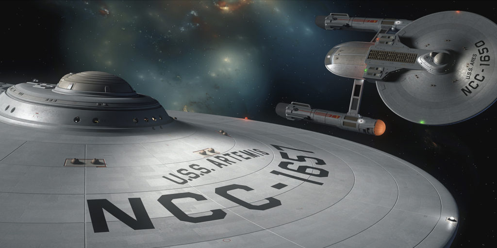
The second thing Alec and Dana were working on was the dedication plaques next to the turbolift doors. They’re making a plexi with a ship schematic plus a brushed metallic plaque with the name, registry, and designers/builders of the USS Ares and another one for the USS Hercules (both starships will appear in the Axanar sequels).
Uh, oh…
I never budgeted for ship plaques! I need scenes on the USS Artemis. We can’t film Captain Jakande on the Artemis bridge and have it say “Ares” behind him! Granted, JOSHUA IRWIN could frame the scene to have Jakande‘s head block the plaques or film him only from the opposite side, but I would hate to limit Josh’s directorial options like that.
So I asked how much for the plaques. Again, if bundled with Alec’s order, I’d save a few bucks. Total cost for both: $250. Drat! There goes 25% of my contingency right there. But then fate decided to help me out…
Literally as I was wrestling with whether to commit to spending a quarter of our contingency on something we didn’t absolutely 100% need, I heard the ping of my Facebook messenger. It was RAY MYERS, the fellow who donated $3,000 and will get his name on the paper coffee cup somewhere during our fan film. As an associate producer, Ray was invited to attend the November shoot, and he was letting me know his flight info. (He’s gonna give me a lift from Lawrenceville back to the Atlanta airport that Monday.)
So after discussing travel logistics for a bit, I decided to be ballsy and typed, “Hey, can I ask you a gift-horse-in-the-mouth question?” “Bring it – i’m in this for the fun,” he replied. And I told him about the two plaques…and their $250 cost. And I asked if he’d be willing to donate just a wee bit more than the $3K he’d already put in. (Yeah, I have no shame!) Of course, I told Ray that the two plaques would be his to take home and keep after the shoot (since he’s paying for them anyway).
A few minutes later, Ray had Paypal’d $250 directly into my bank account. Yippee!!! Major thanks to Ray for that!
So the only thing left was to come up with names (and ranks) to put onto the dedication plaque. Some were obvious, like Admirals GENE RODDENBERRY and STEVE IHNAT. Some were folks on the production team. A few were close friends of mine (all of whom donated). But that still left about fifteen name slots to fill. So I used the names of donors who had given $200 and up…along with their fictional ranks from the campaign. There were 14 of them total—plus MICHAEL WEIR, who was at $197 (which was close enough to be number fifteen). A special shout-out to REECE WATKINS for coming up with the ship’s motto at the bottom: “The true huntress needs only one arrow.”
Here’s the final artwork of the Artemis plexi and dedication plaque (including the logo). Both are now at the printers along with Alec’s order for his plaques…
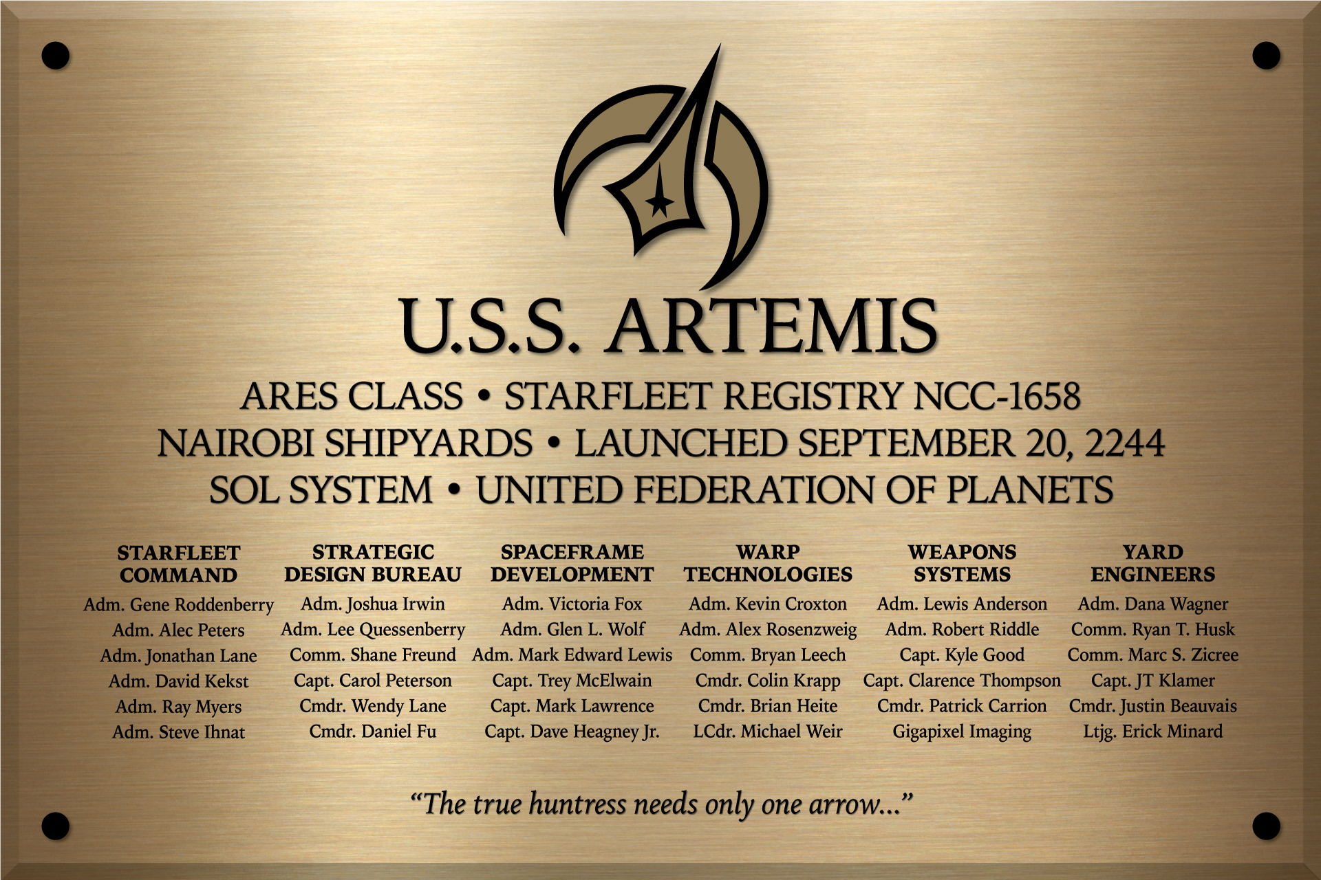
I also want to give a HUGE thank you to Dana Wagner for assembling the artwork for these two plaques and doing so at warp speed. When Axanar and Interlude finally happen, know that neither would have been possible without Dana.
And finally, as I rapidly discover just how quickly contingency funds can disappear, I just want to remind everyone that the Interlude GoFundMe campaign is still taking donations up until the end of October. If you feel like donating just a little more (or if you haven’t donated yet but still want to), here’s the link…
https://www.gofundme.com/f/interlude
You WILL be personally thanked!
How about have if be printed on the back side of the Ares plaque and use Velcro to hold the plaque in place, then shoot with it and when done, pull it carefully off the bulkhead and remove the Velcro dot and clean with goo gone abc apply new ones to
The corners of the other side! That way you all can save on the cost of the brass substrate the plaque is printed on.
I’m not sure it works that way. The printing of the back side could interfere with the front side’s finish.
But no matter. The order’s in. The credit card’s been charged. No need to make suggestions, Ron.
Johnathan I am truly honored to have my name on the plaque. Thank you.
Is there any chance I can buy an Artemis shoulder patch? Those are awesome.
As a matter of fact, Alec is considering selling Artemis patches along with the other ship patches! More news of than soon.
Thanks for including me!
You, Dave, and Justin were all included because of the fantastic work you do over on Fan Film Forum, Colin. It is truly appreciated.
Awesome story, it was especially nice to see so many familiar names on the plaque,…..
Admiral Johnathan Lane! Had to smile when I saw that.
Rank hath its privileges. 🙂
I like the idea of having a distinct Moon shape within the design. Since our next attempt to land on the Moon is the Artemis Program. The idea that those in the future have a sense of history is important to the humanity of the Federation.
Yeppers!
That’s awesome. I can’t wait. I never imagined my name would be on a Starfleet Ship Plaque.
Mine is on two plaques! But this isn’t a competition. 😉
Thank you for relating the
“process”.
It’s fun to share with others. 🙂
Awesome stuff here. you said that the moon wasn’t typically a weapon but what if …”That’s no moon… that’s a space station…”
Please forgive the Star wars quote in a Star Trek fan film … what can I say…. I’m a nerd.
See you in Atlanta in a few weeks.
Well, technically, you could throw a moon at a planet…or even just rip it out of orbit and screw with the tides and tectonics. So yeah…moons are weapons, too. 🙂
These blogs are always interesting and it’s nice to appreciate the thought that goes into these things.
But this does makes me think of Hitchiker’s though. If the Axanar universe were a reality, I picture of group of dedicated engineers and scientists hard at work on new designs of starships. They leave no stone unturned to push the technological envelope, strive for gains in performance, all in an unceasing quest for any edge they can provide for Starfleet in their desperate battle against the Klingons. A struggle that will decide nothing less than the future of the Federation itself.
Meanwhile, in another room, there’s a group of marketing executives asking, “How do we relate to starhips? What do we call them? What colour should they be? Yes, you’ve got phasers and shields, but what about the mission patch?”
OK, if not Douglas Adams, maybe Dilbert.
Seriously though, the badge does look good and you’re clearly having fun with this. It’s gonna be great!
Meanwhile, I’ll go back to my cubicle… 🙂
Ah, yes…branding and merchandising. Makes me think of another sci-fi classic:
Hey Jonathan,
Maybe your next fan film could be a sequel to the TOS episode, “A Piece of the Action”
It could be set in our era of society, since the planets inhabitants are so quick to evolve. A visit say 5-10 years after Kirk was there? Could still use Enterprise sets existing.
“McCoy is concerned because he seems to have left his communicator behind somewhere in Okmyx’s office. Kirk and Spock speculate that with that kind of technology, such as the communicator’s transtator in the hands of the Iotians and with their gift for imitation, the Iotians may one day want a piece of the Federation’s action. ” Quote from Memory Alpha website.
There wouldn’t be much need for sets. Location shoots are all local. Pick any city! Personally, I would have them using all modern muscle cars! Maybe Jay Leno might want a piece of that action, since he does have a $500,000 Ford GT in his garage!
I passed Leno once on the 405 Freeway driving south through Sherman Oaks. He was in a classic MG. It was like looking a a GI action figure crammed into a Corgi car! 🙂
Anyway, I’m not really thinking about making a career or even a hobby out of producing Trek fan films. This was just an itch I needed to scratch.
I’ll never look at the moon the same way again…
Nice work, and thank you for sharing the process. Cheers.
Love the story about how the insignia evolved, and very impressed with the final result. Makes the standard Starfleet/Enterprise “delta” look really boring. I don’t suppose I need to tell you there’s a good deal of debate about whether the use of the “delta” across all ships as they do in Discovery and all post-TOS/TAS Star Treks is canonical or not, but whatever. You’ve decided to go with the logo-per-ship idea that SOME TOS episodes used. And, as such logos go, this is a really nice one. You can always retcon this as being an idea that was abandoned by Pike’s time. But I’m partial to this explanation: https://www.startrek.com/article/starfleet-insignia-explained . Of course, since you’re not in official Star Trek canon, this is simply an alternate universe where the Klingon War from Star Trek Discovery never happened and the one from Prelude to Axanar did. It’s not Star Trek AT ALL! Take THAT, CBS!
Actually, if one looks closely at my script, the only things taken directly from Star Trek are the word “Klingon” and the general look of the D7. And we might have the word “Starfleet Academy” appear under Slater. We use the word Vulcan as a planet, not a race. So that’s only three (at most) direct elements of Star Trek IP in Interlude. Most fan films go way farther than I will.
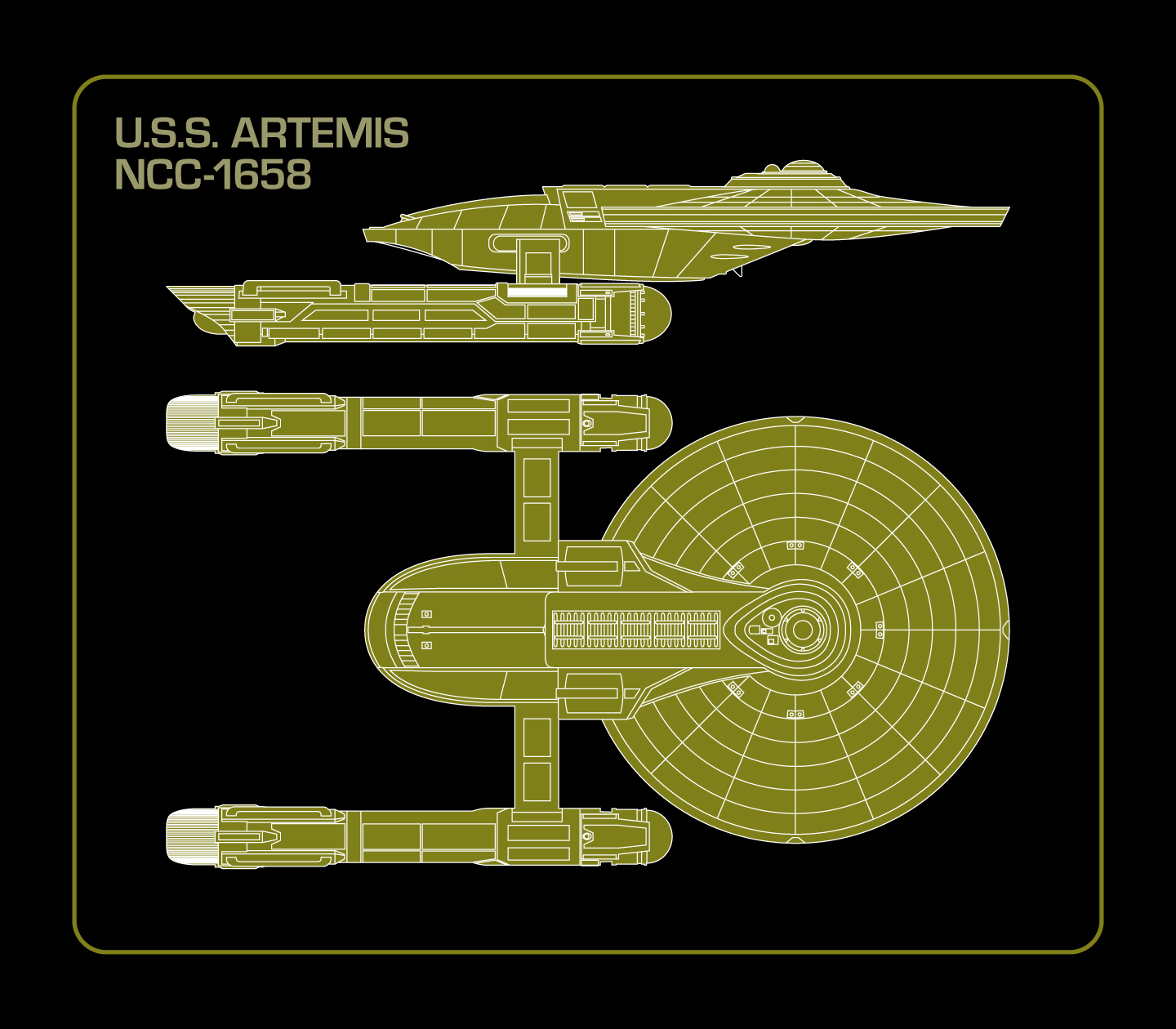
Cool patches and logos! Minor problem: the image at the top of the article has the wrong number. NCC-1657 is the Hercules. NCC-1658 is the Artemis!
Yeah, don’t get me started on that! Alec approved that NCC number for Artemis before finalizing the Hercules patch with the same damn number! Now poor Lewis has to redo the texture map for that CGI model and re-render shot #2. At least he works for peanuts (or maybe just a Thai dinner that includes a dish with peanuts).