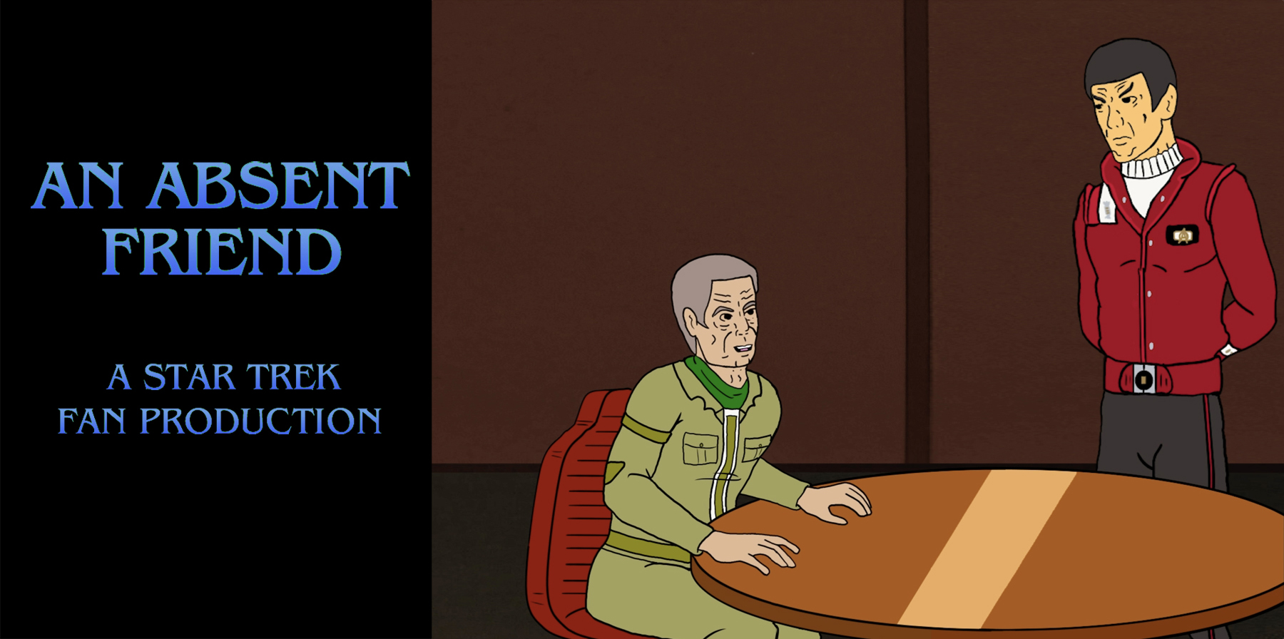
In part 1, I explained how I had used Artificial Intelligence (A.I.) to synthesize the voices of Spock and McCoy to speak the words of a script I originally wrote as a short story back in 2010. In it, Captain Kirk has just “died” saving the U.S.S. Enterprise-B (in the feature film Star Trek Generations), and Bones is getting angry-drunk mourning the untimely passing of his longtime friend. Spock finds McCoy sitting alone in an unnamed bar and offers to join him. It’s the last thing the doctor wants—a Vulcan with no emotions—but, ironically, the thing he most needs. And Spock needs McCoy, as well, even though the Vulcan would never openly admit it.
The story was always intended to be a sort of a two-actor stage play, simple but poignant, giving a glimpse into how these two longtime friends and colleagues deal with the loss of AN ABSENT FRIEND. But the story/script sat quietly on my hard-drive for more than a decade, unused and mostly unpublished, waiting for its “moment.”
That moment came when I discovered the ElevenLabs website (thank you, RAY MYERS!), which can generate synthesized speech from any decent voice sample of a minute or two. Assembling verbal snippets from LEONARD NIMOY and DeFOREST KELLEY from various sources, I set out to create an audio drama of my script. The project took me a couple of months, and I explained the nuances of how I did it in part 1.
Now in part 2, I’ll explain how I got from that audio drama to this completely animated Star Trek fan film…
As I mentioned in part 1, after I completed the audio drama, I was frustrated by the subtle inconsistencies between sentences (especially for McCoy) due to my generating the voices in short segments. This was a necessary evil due to the limitations of the early A.I. technology, but it still bothered me.
Then I had an idea…
If I added a visual element to the audio drama, I could shift camera angles and/or images when those inconsistencies happened. It wouldn’t be a perfect solution, but perhaps the eye seeing something different would allow the ear to “forgive” those inconsistencies, at least a little.
STRIKES ONE AND TWO
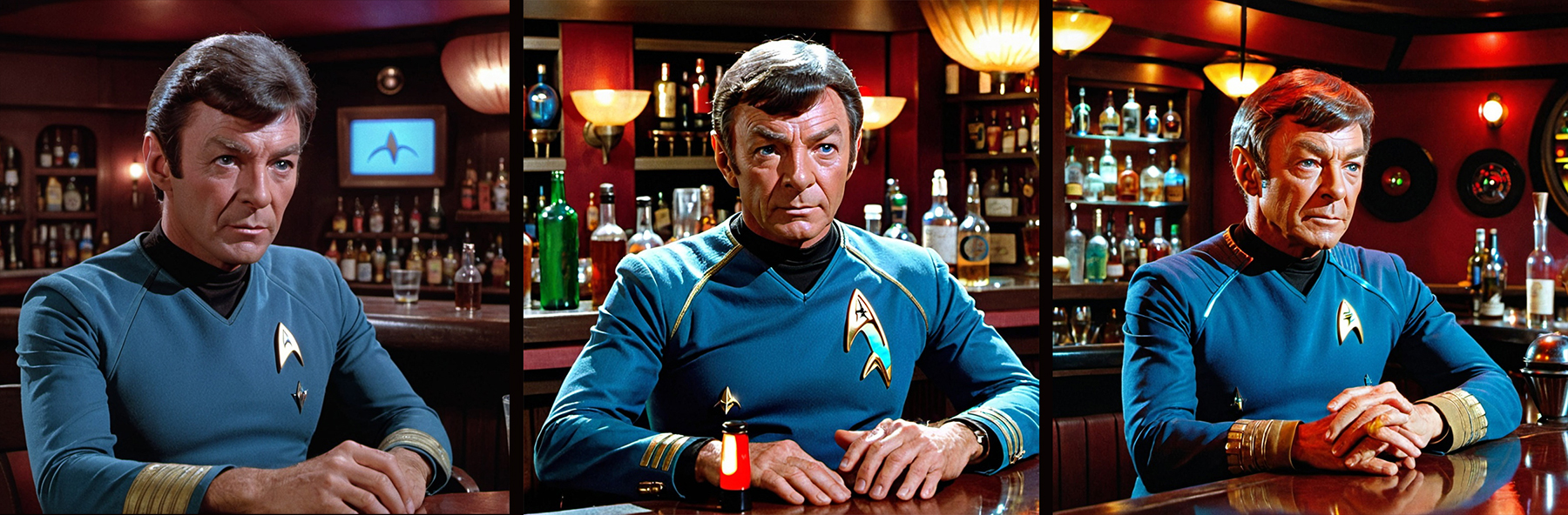
At first, I thought about just having some static images of McCoy and Spock and switching between them. There are certainly enough of McCoy in that bar scene from Star Trek III, although DeForest Kelley looked a lot younger in 1984 than he did in 1991 in Star Trek VI, the last time we saw him in a Star Trek film. And this story takes place around that same time in McCoy’s life. Also, there are certainly no images of older Spock in a bar, although the idea of doing some Photoshopping on my part briefly occurred to me.
Then I thought, “Hey, if I’m using A.I. to generate the sound, why not use A.I. to generate the images!” So I gave that a try and quickly discovered that, unfortunately, artificial intelligence isn’t intelligent enough (yet) to do what I needed it to do. By entering “Dr. McCoy from Star Trek,” you kinda lock in McCoy from TOS, even if you say “Dr. McCoy from the Star Trek movies” or “Dr. McCoy from Star Trek VI: The Undiscovered Country.” And forget about asking for him wearing “normal clothing” or “civilian clothes.” He always shows up in the variant of his blue TOS tunic…
Add to that the problem of the background image of the bar constantly changing to a new bar, the inconsistency of what the algorithm considers “an older Dr. McCoy,” and those weird hands with too many fingers (A.I. has NOT mastered hands yet), and this idea turned into a very frustrating dud.
THE SOLUTION
Ironically, or perhaps fittingly, it was CBS Studios that gave me the answer I’d been looking for.
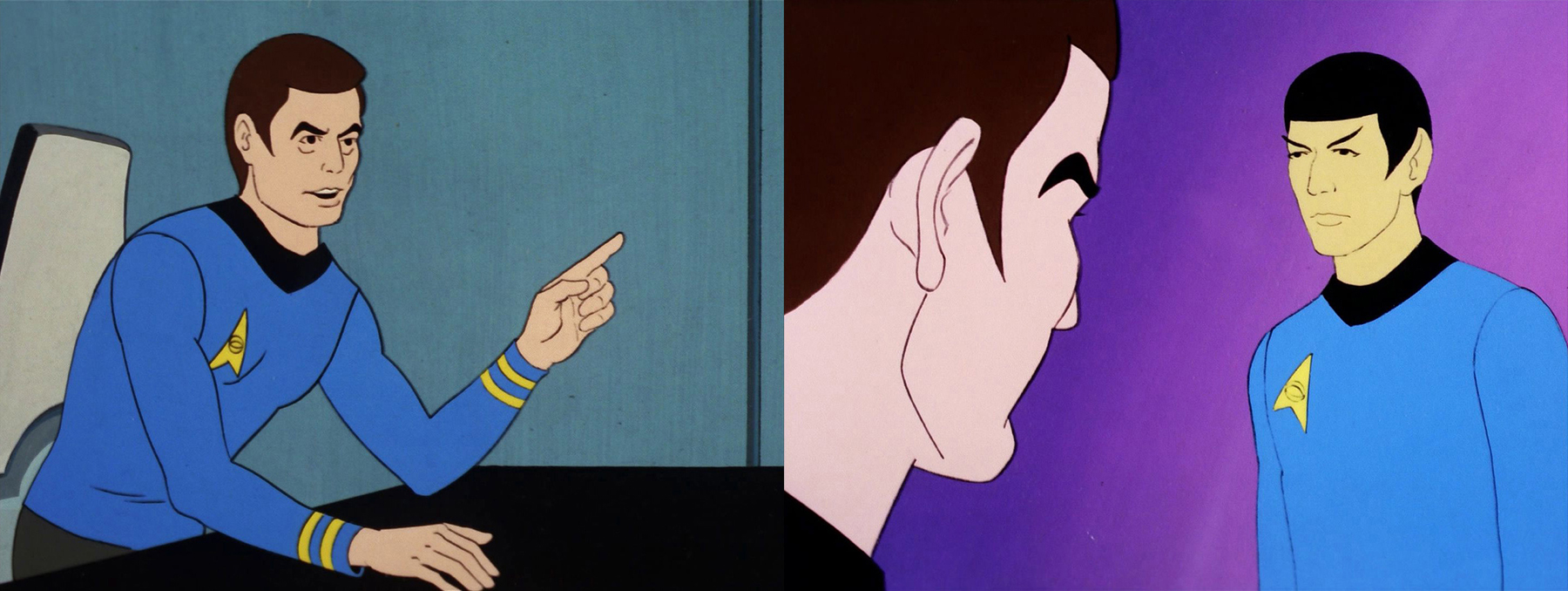
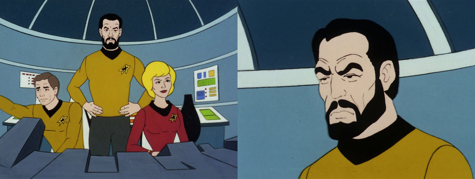
As I was wrestling with my conundrum in September of last year, Paramount+ began airing five VERY SHORT TREKS, each done in the style of the Filmation animated Star Trek series of the 1970s. Of course! If it was a snake, it’d bit me! Just animate it TAS style, moving only the lips and eyes, just with a movie-era uniform on Spock, civilian clothes on McCoy, and more wrinkles on both their faces. The perfect idea!
Except that I’m not an artist.
I’m a decent art director, but I come from a graphic design background, not illustration. And I certainly couldn’t draw well enough to make a believable Spock or McCoy! I needed to find someone who could draw and was willing to work under the constraints of the fan film guidelines…which say that you can’t actually pay people to work on a fan film. Good luck in that quest!
BRINGING ON AN ILLUSTRATOR
In the second bit of serendipity (after the Very Short Treks inspiration), I was just about to ask VANCE MAJOR for the contact information for the artist who’d drawn his CONSTAR COMIC, a fellow named MATT SLADE, in order to interview him for Fan Film Factor (an interview I still need to do, by the way!).
After explaining the situation and the guidelines limitation, I asked Matt if he might be willing to take on the project…and for some strange reason I cannot comprehend (considering how many hundreds of hours he ultimately put in), he said yes! He told me that he could draw in the Star Trek TAS style if he had some decent reference to trace over. He’d be able to add wrinkles to the faces and change the clothing, but he needed something to work from.
“It’s a deal!” I said.
And that began a solid month of me going through every single TAS screen cap on Trekcore.com (there are literally thousands!), copying each one that featured either Spock or McCoy, or both, and saving them into layered Photoshop files sorted by episode.
Next, understanding that I couldn’t overwhelm my artist with too much work, I went in and chose the best stills of Spock and McCoy that I could find—about three dozen combined—a mix of full-body, half-body, upper torso, and facial close-ups. Then I laid them all out in storyboard format over my finished audio drama mp3 file. I also gathered as many still images of the maroon Starfleet “bomber jacket” that Admiral Moro and Scotty wore in Star Trek III (and IV for Scotty) and Kirk wore briefly in Star Trek V. That is my absolute favorite uniform style, and I was hoping Spock would be wearing in this fan film. But Matt would need ample visual reference.
FROM ART DIRECTOR TO FILM DIRECTOR
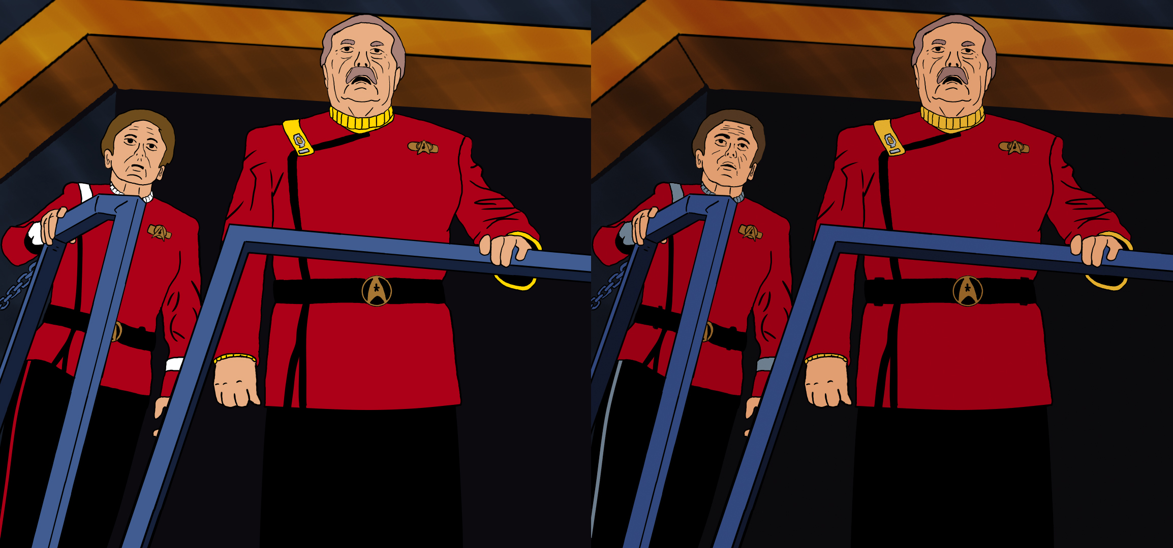
I quickly realized, from a designer’s/director’s perspective, that I needed to follow the 180-degree rule for filmmaking. What this means is that, if McCoy was going to start on the left side of the screen facing right, then he needed to stay facing either right or forward for the entire film, especially if he’s seated most of the time. In the same way, Spock needs to primarily be on the right facing left. Otherwise, the inconsistency plays tricks on the viewer, and something feels “off” about the film.
Fortunately for me, the animators at Filmation in the 1970s understood this, too, and created their drawings of the characters’ faces to be pretty much symmetrical, meaning they could easily be flipped horizontally. You just needed to remember to move the chest emblem of their uniform. So when a still image wasn’t facing the right direction, I simply flipped it (leaving Matt to put Spock’s chest emblem on the correct side when he drew Spock’s movie-era uniform).
Another thing I did as a film director was to address the “monotony” factor. Just seeing McCoy, then Spock, then McCoy, then Spock, then McCoy again, then Spock again for 15 minutes could become visually repetitive very quickly. So I decided to add in some “flourishes” along the way: stills of people and things that each character was talking about: Kirk, Scotty, Sulu, the Enterprise-B, etc.
I also needed to find a TAS character to “play” the bartender. I didn’t want to have it be an alien, as this was set on Earth, and I didn’t want this character to be a visual distraction. I just needed an average, everyday-looking kinda guy, and fortunately there was a bearded Starfleet captain from “The Pirates of Orion” who fit the bill perfectly.
I also grabbed a couple of “for inspiration only” stills for establishing shots of McCoy and Spock sitting together at the same time. These were there only to give Matt a starting point, not for him to trace over.
If you’re curious what this strange storyboard version looked like, I’ve uploaded it to my GoogleDrive account here. But be warned, it looks really weird seeing TAS stills over my audio drama. And if you do watch it, you’ll notice in the lower right corner codes like “McCoy 17-21” or “Spock 22-43.” These were guides for me to find the original still images. The first number was the episode (for example, 22 was “The Counter-Clock Incident”), and the second number was the layer of the Photoshop document with that specific still image on it. Yes, I was very organized (with thousands of still images, you kinda have to be!)
ANIMATING LIP MOVEMENTS
Armed with this storyboard guide and jpg files of each still that I wanted to use, Matt got to work. Of course, the next challenge was that neither of us knew anything about how to animate lip movements! Fortunately, there’s the Internet and YouTube, and it didn’t take me long to find this video. If you don’t want to spend time watching it, worry not because I can summarize it quickly. Apparently, nearly all mouth movements for every sound and word in the English language come down to just NINE different animation variants. Really…only nine!
And here they are with examples for each for McCoy and Spock:
ah – i

ee – eh – en – uh

oo – u – ur – w- r

oh
b-m-p

f-v

l – th

s-c-z-sh-ch
closed

This last “closed” mouth position can be used both for pauses between words as well as for any consonant phoneme that isn’t listed above, like d-g-h-j-t. So to take a few examples, here’s what the word “appropriate” would require:
(ah-i) + (b-m-p) + (oo – u – ur – w- r) + (oh) + (b-m-p) + (oo – u – ur – w- r) + (ee – eh – en – uh) + (ah-i) + (closed)
Yep, a four syllable word would require nine different mouth positions!
Here’s the word “Enterprise”:
(ee – eh – en – uh) + (closed) + (oo – u – ur – w- r) + (b-m-p) + (oo – u – ur – w- r) + (ah-i) + (s-c-z-sh-ch)
This is “Spock”:
(s-c-z-sh-ch) + (b-m-p) + (ah-i) + (s-c-z-sh-ch)
And this would be “Doctor McCoy”:
(closed) + (ah-i) + (s-c-z-sh-ch) + (closed) + (b-m-p) + (s-c-z-sh-ch) + (oo – u – ur – w- r) + (ee – eh – en – uh)
I needed to experiment a bit with the “oy” in “McCoy,” as the video didn’t really cover that phoneme. I finally decided that the “uh” plus “ee” cells together seemed to look correct when I viewed it. And there were also a few others that I ended up having to figure out as I encountered them. It was a…fascinating…learning opportunity.
And if you’re thinking that this sounds like a LOT of work for a 15-minute animated fan film, you are absolutely right! While my artist Matthew spent hundreds of hours drawing each of the nine mouth positions for each of the 36 poses for both characters (plus the bartender), I spent hundreds of hours myself toggling back and forth, frame by frame, through each syllable of every line of dialogue, placing the correct version of each lip position into the video project timeline. It was painstaking, let me assure you!
But it was also magical. As I would go through a sentence, placing cell after cell wherever the sound changed, I’d often come to a stopping point and want to give my brain a little rest. So I would take a moment to play back the video segment of what I had just completed. And gosh darn it if it didn’t look like McCoy or Spock was actually speaking the words I’d written!
The mind is actually very forgiving when watching lip movements over animated voices, but not entirely forgiving. Occasionally, I’d see a cell or two or three that just looked off, and I’d need to make tiny adjustments, sometimes moving a cell only a single frame forward or back in the timeline. As I said, VERY meticulous work, but in the end, extremely rewarding.
HELPING OUT MY OVERWORKED ARTIST
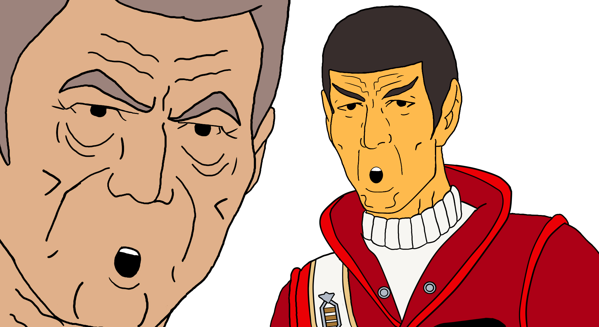
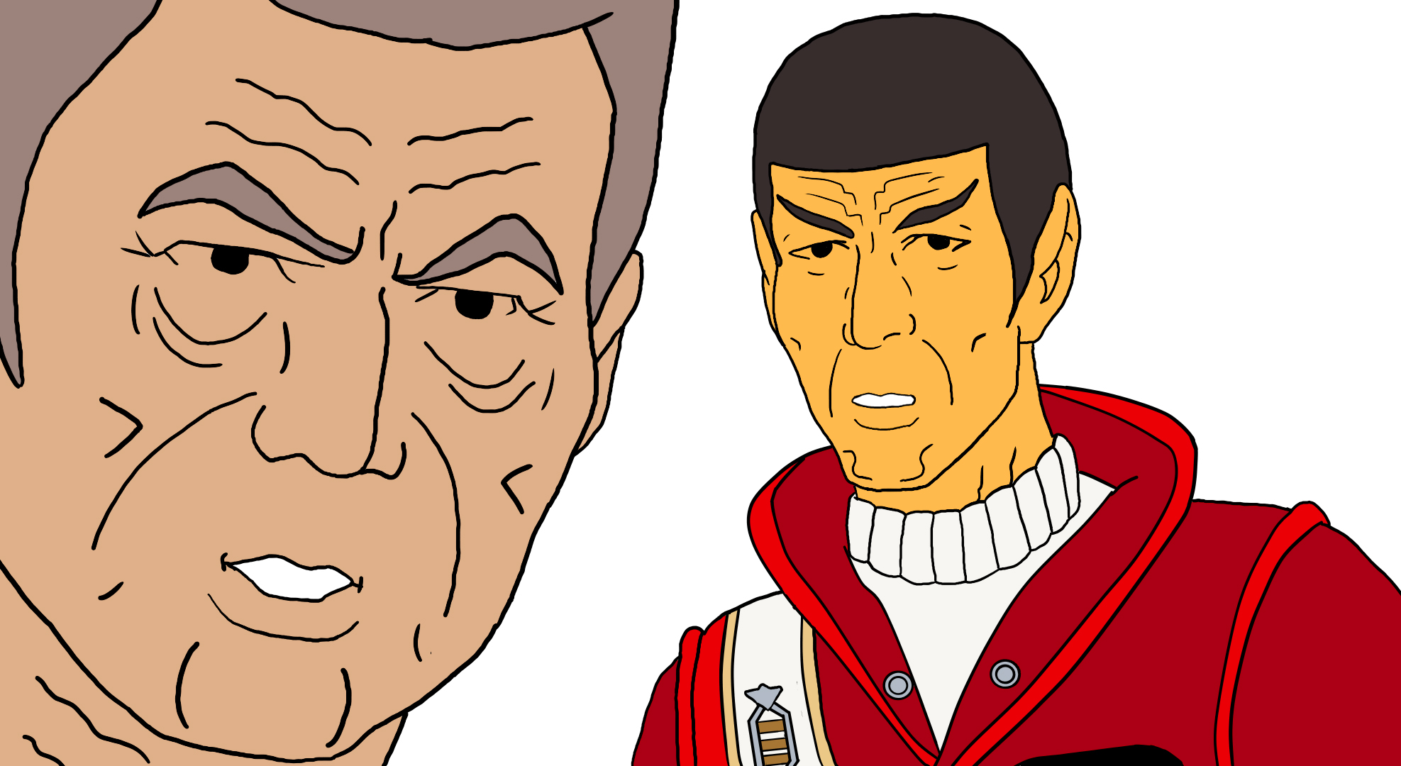
My efforts on the visuals didn’t end there, however. While I certainly can’t draw things from scratch, I’m comfortable enough to make small adjustments to artwork that I’m given, which I did quite often (with Matt’s okay, of course). For example, here’s a cell where I did a little tweaking—Matt’s original is on the left…
Matt was struggling to get Chekov’s face right. So I added in some lines of my own and shifted a few others. Still not perfect, but a bit better. I also corrected the colors of Chekov’s and Scotty’s tunics and hair along with adding belt loops. (Yep, I’m a perfectionist!) Here’s another example featuring Sulu…
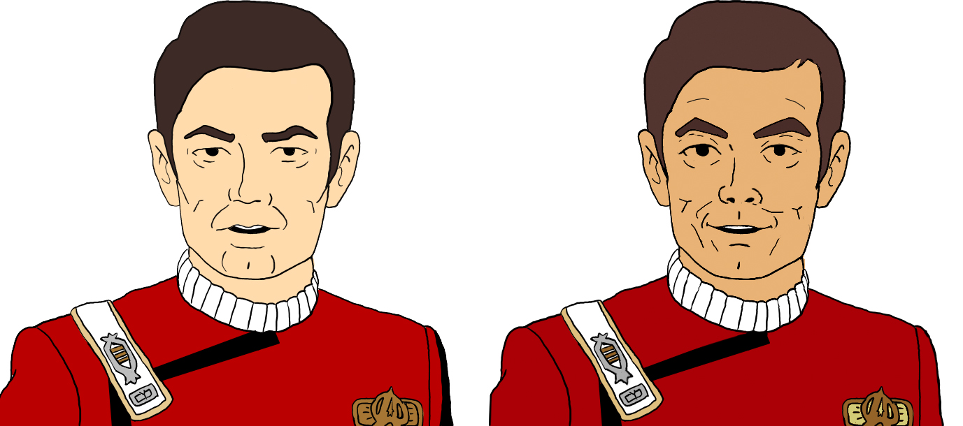
Matt initially traced over a Sulu screen cap from the TAS episode “The Slaver Weapon,” so technically, his Sulu was accurate. But I felt the rendering still looked too young. So I added some more wrinkles (sorry, George Takei; you still look amazing!), widened the eyebrows, adjusted the nostrils, tweaked the smile, and altered the skin tone and hair color slightly. I also added the cream color to the interior of the chest emblem. There were many examples of this kind of tag-team effort, and Matt welcomed the help…as it was much easier for him to have me make the adjustments the exact way I wanted them.
At this point, I need to take a moment and compliment Matt as not only an incredibly talented artist but also a true professional with patience and a wonderfully positive, collaborative attitude. I’ve worked with countless illustrators since my days in design school back in the early 1990s, and through my decades as an art director and, later, creative director. And I can honestly say that I have never had a more pleasant partnership with any artist…period. I know Matt is struggling to find illustration work these days, but in all sincerely, if you’re looking to hire a gifted, passionate, productive, and highly responsive artist, I cannot recommend Matt Slade highly enough! (Put that on your resume, Matt.)
There were a couple of other, easier art duties that I handled myself…not wanting to ask too much of my already-overworked illustrator. While I’m not a skilled freehand illustrator, I know enough tricks in Photoshop to do something like transforming a 3D rendering of a space ship into what looks like it’s been illustrated…

The original 3D rendering is on the upper left. Below that is the “painterly” version that I Photoshopped for when McCoy calls the Enterprise-B “the Excelsior with water-wings.” And then Matt took that image and turned it into the flashback of the Enterprise-B getting struck by the nexus anomaly. As I said, a wonderful collaboration.
THE BACKGROUND STILLS
The other thing I did entirely on my own was the bar interior backgrounds behind McCoy and Spock (with the exception of the one behind the bartender and one at the end where McCoy and Spock are standing by the door , which were both Matt). For the flat walls backgrounds, I started with actual stills from TAS, which were typically blue-gray walls inside the Enterprise. I darkened and colorized them, keeping the watercolor flavor of the original artwork. And, designer that I am, I did a little extra something that you probably didn’t notice (one of my old art school teachers used to tell us students: if a graphic designer has done their job properly, most people won’t notice). Here’s what I did…
First of all, there are about a dozen different background cells which change depending on whether you’re looking at the front, side, or three-quarter angle of each character. This keeps the film subtly dynamic rather than visually monotonous. But I also tinted the color of each character’s backgrounds to make each distinctive. McCoy’s are duller-but-slightly-lighter gray tones. Spock’s are a deeper, richer brownish hue. Why those particular choices? Well, partly it was because those colors worked better with their clothing—McCoy’s greens and Spock’s red (which, I might add, are quite purposefully supplementary colors…go to the link to understand why).
But I also wanted to be somewhat poetic. McCoy had been trying to use the alcohol to deaden his pain, resulting in a gray fog of ambivalence and apathy. But it didn’t work. Spock, on the other hand, was coming in as the emotionless Vulcan, but deep down, he is feeling the pain of Jim’s loss and simply cannot express it. His background color is deeper and darker and also a very warm reddish brown, suggesting the hot passion of anguish he is trying to keep buried. So McCoy’s background suggests colorless fog while Spock’s is deep dirt covering up something he desperately wants to hide…even from himself and especially from Bones. (Bet ya had no idea I’d given it this much thought, didya?)
THE OPENING CREDITS SEQUENCE
Meanwhile, there was another visual ingredient I needed for the project: the opening credits. The “gag” I wanted to start with was a bottle spinning in slow motion, an homage to the opening credits of Generations. But instead of Château Picard champagne shattering against the hull of the Enterprise-B, it would be a bottle of bourbon shattering against the side of a bar.
The first question I needed to answer was “What brand of bourbon?” I’m not really a drinker, so I went to the Internet. McCoy is from Georgia, but there’s no bourbon that identifies specifically with Georgia. A number of brands are associated with Kentucky, so that didn’t help much. But then I saw it: “Southern Comfort.” That was exactly what McCoy needed after Jim Kirk’s death: comfort. And McCoy is southern. Perfect…even though Southern Comfort is not exclusively bourbon-based, and the brand is from Louisiana, not Georgia. But it was close enough.

Now I just needed to find a 3D animator who could generate the same movements of the slowly spinning bottle as in Generations. I approached my longtime friend (since we were teenagers) ADAM “MOJO” LEBOWITZ, who has actually won two Emmys for his VFX. I realized it would be “slumming” for him to animate something as simple as a spinning bottle, but I asked him for the favor anyway. He agreed. And while I’m not paying him, I have picked up the tab for the first of at least two expensive sushi lunches I will be treating him to!
One issue I hadn’t thought of was that a high-quality animation might look too realistic for a fan film done in TAS cartoon style. So Mojo rendered out a lower quality “previz” version, which looked closer to cartoon. I had to provide the bottle smash animation at the end myself (I bought a stock animation online and colorized it), and I created Generations-style opening credits text for everyone involved. And suddenly—voila!—I had my fan film intro!
THE MUSIC
And finally, I needed original music. While a lot of Star Trek fan films do, in fact, use existing music from the various TV series and movies, and CBS/Paramount usually don’t seem to mind, I don’t like taking chances. The film only has two short pieces of music: under the opening credits was the overture from Star Trek Generations, and then the closing credits would use the typical episode outro from the animated Trek series. So I didn’t need much. I just wanted music that sounded like those two pieces without being identical.
I reached out to MATT MILNE (I’ve had good luck with Matts on this project!) in Scotland for some assistance. Matt has been composing an incredible amount of amazing music for SAMUEL COCKINGS’ TREK SHORTS series of fan films…which you should absolutely check out if you haven’t already! Matt was quick to say yes, and within a week or so had sent over to me exactly what I needed—and even something extra that I didn’t even know I needed. That little opening flourish under the dedication to Leonard and De at the beginning, that was entirely Matt. I was just going to leave that moment silent. But his music worked absolutely perfectly there.
I am so happy with my Matts and Mojo on this project! This has been such a fun (albeit time-consuming and challenging) fan film to work on…and oh-so-satisfying to finish after nearly a year.
Okay, so we’ve answered the question of “Can Jonathan create a Star Trek fan film using A.I.?” Yes, he can (with help!). Now the question that remains is one of both legality and ethics: “SHOULD Jonathan create a Star Trek fan film with A.I.?” And we tackle that question in the concluding Part 3 of this blog series…