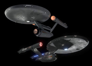
 Don’t get me wrong: I actually like some aspects of the new old U.S.S. Enterprise NCC-1701 that briefly appeared in the season finale of Star Trek: Discovery. (For convenience, I’ll be calling it the “Disco-prise” since “Second-prise” is just plain silly!)
Now, the J.J. Abrams version of the U.S.S. Enterprise from the 2009 reboot Star Trek movie, that one I hated. I think it is a visual travesty, and we shall not speak of it further.
But the Disco-prise, it’s mostly okay with me. I don’t even mind those strange “tail fins” that seem to have been added to the back of the nacelles for no apparent reason (you all realize that there’s no air resistance in space, right?) I sorta like the design…but I definitely don’t love it.
On the other hand, the original U.S.S. Enterprise, designed by WALTER MATT JEFFERIES in 1965 (and altered slightly in 1966 when the Star Trek TV series was picked up for broadcast)…now THAT ship I LOVE. There is not an angle of that magnificent space vessel that I can’t look at for hours or draw from memory. In my opinion, that iconic starship is perfect, a profoundly elegant work of art! (I feel the same way about the refit U.S.S. Enterprise first seen in Star Trek: The Motion Picture in 1979.)
So why don’t I love the new Disco-prise? It’s not a bad design, but for some reason I couldn’t put my finger on, it just didn’t seem like the work of art that the original was. And about three weeks ago, I finally discovered the reason…
 “Well, of course you don’t like it as much,” said my friend Bill (no, not Shatner), “It doesn’t use the Golden Ratio.”
“The Golden Ratio?” I asked, having never heard the term before.
“Yeah,” said Bill, matter-0f-factly, “You know…Phi? 1.61803. Tell me you know this! And you call yourself a Trekkie???”
“I know Pi,” I said sheepishly. “3.14159.”
“Oh, Jon, I thought you took math classes at Cornell! How can you not know this??”
“I switched to Psychology in my sophomore year, dude, cut me some slack! So what does Phi have to do with Star Trek?” I asked.
“Only everything!” he replied. “Once I tell you what I’m about to tell you, you will NEVER look at the U.S.S. Enterprise the same way again!”
Okay, if you haven’t figured it out yet, Bill’s a bit of a math geek in the way that most of the rest of us aren’t—so I’ll spare you from the long explanation of what the Golden Ratio is. However, I do recommend that you watch the following video if you can handle just a wee bit of math (and fun math, not the boring kind!)…
Or maybe you’d prefer a Disney cartoon with Donald Duck…
If you didn’t watch the videos, the short summary is that there’s this number Phi (Φ) that, like its cousin Pi (π), is an irrational number that forms a never-ending decimal:
Φ = (1 + √5) /2 = 1.61803398874989484820…
This number appears in the “Golden Ratio” { 1 : 1.61803 } that almost magically seems to appear nearly everywhere: in nature, art, architecture and design (yep, even in the Toyota logo)…
 Now, whether or not this “Golden Ratio” of 1 : 1.61803 is evidence of some kind of intelligent design or it’s just some cosmic coincidence, there have been studies that have shown that human beings react most positively to designs and imagery that include adjacent elements with a ratio approaching 1 : 1.618. Painters from the Renaissance (like DaVinci, Michelangelo, and Raphael) to French impressionists like Seurat all the way to Salvador Dali used the Golden Ratio quite often, as have architects and designers.
And guess who else used it? Matt Jeffries, when he designed the U.S.S. Enterprise, put Golden Ratio elements all over that starship…and I’ll show them to you shortly. Granted, Jeffries, who died in 2003, never spoke in interviews about whether he purposefully employed the Golden Ratio (and I’m not even sure he was ever asked), but there are just so darn many, I can’t believe it’s just a coincidence!
My math buddy Bill began by sending me this article that shows a number of the Golden Ratios present in nearly all orthogonal views of the Enterprise…and that started to blow my mind. But then he told me to play around in Photoshop and see how many more I could find…and that’s when my mind EXPLODED (and so will yours)!
Are you ready to jump down the rabbit hole?
First, credit where it’s due: I used some nicely rendered CGI image from this fellow’s Deviant Art page, and I promised I’d include a link.
Also, Bill recommended that I illustrate the Golden Ratio by first drawing for all of you this “golden rectangle” where the ratio of the length to width is 1 : 1.618.
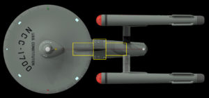
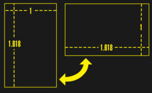 Then he suggested that I start my descent down the rabbit hole as simply as possible by putting just a single one of these rectangles over the dorsal (neck) of the USS Enterprise because that’s kind of the central point of the starship…

With me so far? Well, here’s the first mind-explosion. Bill told me to take that rectangle and move it around to see how many elements of the Enterprise were exactly the same height as the dorsal (neck). Look what I found…
WHOA…right???
The height of the dorsal (neck) is the same as the height of the front of the warp nacelle AND the navigational deflector dish AND the rear of the secondary hull! It’s also the distance from the top of the bridge to the lower edge of the saucer AND from the higher edge of the saucer to the bottom of the photon torpedo launch dome.
Now, in case you’re wondering, no, that has nothing to do with the Golden Ratio. It’s just really, REALLY cool. However, this next part is totally about the Golden Ratio, and to discuss it, Bill told me to show you this…
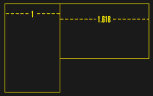
This time, the “golden rectangles” are touching. Why is that important? Because when two adjacent (next to each other) elements of an image have the proportion of 1 : 1.618 (like the pictures of the pretty things at the top of this page), they look pleasant and beautiful to the human eye…even if it’s just on a subconscious level.
And so, let’s go back to the Enterprise and use the touching rectangles this time…
How about that! The ratio of the height of the dorsal (neck) to the height of the widest part of the secondary hull is 1 : 1.618! It’s also interesting that the ratio of the height of the dorsal to the width of the dorsal is also 1 : 1.1618.
And if you’re beginning to think that I’m going to start finding that Golden Ratio of 1 : 1.618 pretty much everywhere on this starship, well…YOU’RE RIGHT!!!
Ready for the next one?
The ratio of the height/diameter of the cylindrical nacelle to the height of the nacelle’s support pylon is that Golden Ratio again! Also, notice that the distance from the front edge of the pylon to the front edge of the nacelle (where the red dome hits the gray part) is about the same length as the height of the pylon.
Still think it’s just a coincidence? Then check out this next one…
There’s another Golden Ration BELOW the support pylon…as the thinnest part of the secondary hull in the rear is just about 1 : 1.618 as long as the height of the pylon. Also note that the front edge of the pylon is the exact same distance from the back edge of the secondary hull (where the curved hangar doors start) as it was from front edge of the gray part of the nacelle in the previous picture.
Oh, one more cool one that I noticed…
 That same box from the dorsal fits perfectly over the intercoolers on the top-rear of the nacelles. In other words, those intercoolers are the same length as
- the bottom of the dorsal
- the height of the widest part of the secondary hull
- the height of the pylons
- and all the other measurements I just showed you.
Same yellow box, folks! And just for fun, as you can see above, I rotated the rectangle and discovered that the back edge of the intercooler is just about the Golden Ratio away from the back of the entire nacelle.
Does your brain hurt yet? Yeah, probably. So let’s switch to a different angle. Are there more Golden Ratios on the top view? You bet your astrometrics there are!
Let’s start with the simplest stuff…
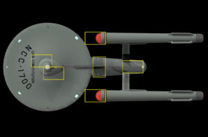
 I drew one of those golden rectangles over the widest part of the secondary hull. Notice that this central box (with the dimensions 1 : 1618) not only is as wide as the secondary hull but also goes from the base of the dorsal on the right to the rear edge of the impulse engines on the left.
Then I rotated this rectangle 90 degrees to give us that Golden Ratio on either side. And guess what! To the left, the length of that raised stripy thing on the saucer between the two impulse vents (what is that stripy thing called anyway?) is just as long as the secondary hull is wide. To the right, the rectangle with the Golden Ratio starts at the base of the dorsal and ends smack dab dead center of the support pylons.
But wait, there’s more! Let’s move those rectangles around a little to see what else matches up…
Moving left to right, we see that the distance from the back of the bridge to the bottom of the letters of the ship name on the primary hull is the same of the length from the front of the bridge to the back of the “half-egg” of decks 2 and 3. But it’s also the distance from the cooling radiators (those black things just behind the red domes) to the closest point of the circular edge of the saucer to the nacelles. And of course, as we showed earlier, the diameter of those nacelles have a 1 : 1.1618 ratio to the diameter of the widest part of the secondary hull.
And look at the back of the secondary hull. That same-sized rectangle fits from the top back edge of the hangar deck to the front edges of the two nacelles…AND it fits snugly just at the base of the two pylons.
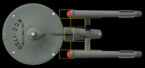
Wanna see something else cool? Take a look at the distance between the secondary hull and the nacelles…
Yep! Mind the “gap” because it’s that same Golden Ratio to the width of the secondary hull and the same as the width of the nacelles themselves.
Oh, and here’s another fun one I found…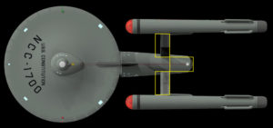
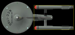
The ratio of the distance between the nacelle pylons to their length? You guessed it! 1 : 1.618. Also note the rectangle over the hangar bay area. The ratio of that back portion of the secondary hull (length : width) is the same Golden Ratio.
Okay, nearly done…just three more. (BTW, my friend Bill only sent me a few of these. Then he told me to look for others because I’d find them everywhere—and he was right! Eventually, it became an exciting game to find more and more golden ratios.)
Here’s one I didn’t expect to find. I just drew one of those golden rectangles around the nacelles, and look what happened! Golden Ratio of length to width…
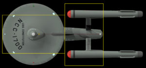
So let’s take a look at the the length (diameter) of the primary saucer section…and then the length of the portion of the secondary hull that’s visible from the top view…
Golden Ratio…check! (We’re not really surprised, right?) Okay, last one…
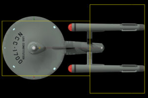 The distance from the back tips of the nacelles to the middle of the nacelle pylons is 1 : 1.618 as long as the distance from the middle of the pylons to the frontmost tip of the saucer.
I’ll save you from having to see me do the same with the front view, but trust me, the Golden Ratio is there, too.
Okay, so how about the Disco-prise? Unlike the original, whose design can be directly traced primarily to the efforts of one person, the ST: Discovery Enterprise was based on concept art provided by John Eaves and Scott Schneider and then refined and assembled by a group of VFX artists from Pixomondo under the direction of production designers, producers, executive producers, and lord knows who else! In other words, lots of chefs in the digital kitchen…
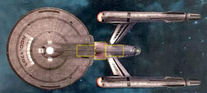
Now, thanks to an Eaglemoss poster that was on display a few weeks ago at a Trek convention in Germany, we now have a studio-approved top and side view of the Disco-prise. And that allows us to see if this new design utilizes that perceptually pleasing Golden Ratio.
First, I’ll draw that same golden rectangle over the dorsal (neck), as I did in the first imagine of the TOS Enterprise, and see if there are any places where that same height appears elsewhere…
Hmmm, it’s kinda hit and miss. The only nearly exact match is the height of the main navigational deflector dish. The heights on the primary hull aren’t really aligning exactly to clean horizontal elements like they did with TOS. And the closest match on the nacelles is far, far at the very back (and it’s possible that part of the image was a little distorted, as this was photographed from a canvas poster).
Okay, let’s look for some golden ratios shall we?
 Nope, none there. Not even close! So how about, instead of measuring against the height of the dorsal, we start with the height of the secondary hull at its widest point?
Nah, that doesn’t work. I’d hoped it might hit the top edge of the saucer, but it misses completely. What about the pylons and nacelles and the back of the secondary hull?
 That’s a little better. There’s a couple of Golden Ratios there at the back. But to save you a really long blog of “no, that’s not it either,” I looked all around the side view, and what I’ve just shown you is as close as things get to the Golden Ratio. Everything else misses badly.
So what about the top view? Once again, I started the same way I did with the TOS Enterprise by putting a golden rectangle around the widest part of the secondary hull and then seeing if there were any Golden Ratios to either side. There weren’t…
If you look at the next image, you’ll see that I did notice that the rectangle in the above image is the same length as that curved black racing stripe along the side edges of the saucer, as well as the same length as the intercoolers on the rear of the nacelles, and the same width as the warp nacelle as seen from the top view. It’s also the same length as the distance from the front of the bridge to the back of the “egg” of deck two…although that’s not the case going the other way.
But unlike TOS, there’s no Golden Ratio adjacent to any of those elements. I’ve also shown how the ratio of the nacelle width to the pylon is completely off…
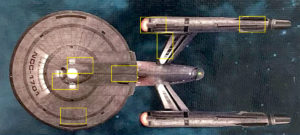 I could go on and on trying to locate Golden Ratios, but honestly, I just couldn’t find them. Most of my searching produced results that looked like this…
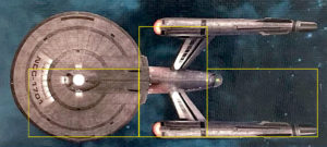 As you can see, nothing is hitting that ratio. Some things get close but still don’t make it. Most of the time, though, there was nothing even close to being close to the Golden Ratio.
With the TOS Enterprise, it was almost impossible NOT to find that Golden Ratio. It was almost as though every time I drew a golden rectangle and turned it 90 degrees, there was another perfect alignment!
Now, does this “prove” (mathematically) that the original NCC-1701 Enterprise is somehow more elegant and beautiful that the redesigned Disco-prise? No, and that wasn’t my goal with this blog. If you like the new design better, more warp power to ya! That’s fine with me.
Instead, I was simply trying to figure out why the new design was missing the mark with me personally. When I learned about the Golden Ratio and how artists like DaVinci and Michelangelo and Dali would purposefully incorporate it into their designs, I examined the original Enterprise and found it everywhere. Matt Jefferies was a genius! Then I looked at the redesigned starship and found it almost nowhere.
Does this explain my different reactions to the two designs? Perhaps. But I can only speak for me.
Which one do YOU prefer?




Actually, Dico-Prise seems to be a kludge of a JJPrise and a Refit Enterprise, and in their attempt to make it “sleek and cool” (because no one cares “how” it works), they just muddy the waters a little. The most amazing thing in all this (other than your finds in the relationships, which go a long ways towards explaining the natural affinity it seems to engender), is the original design was upside down, with the nacelles pointing down, and Gene got a model and had it upside down and loved it. At least that was the story I have heard, which just illustrates how blind luck and the mysterious providence seems to touch the strangest things. Really great article though, have you applied the numbers to the Refit Enterprise, or Miranda? I thought the Miranda from ST2 had a similar balance and beauty.
Hmmmm… I seem to remember the “upside down” story being about the USS Reliant from Trek II. Anyone know about the earlier “upside down” story?
As for looking for Golden Ratios in the refit or Miranda/Avenger class…maybe someday. This blog was exhausting to put together. I need a break from rectangles for a while!!! 🙂
I Kenny Smith like the older one and i will use it and keep it for my project. If tou all like to see this one to be built get a hold of me thru this website. I will keep this one and i will use it. Please do keep this on your website here. I am looking and working on to talk to the person who have the land on matherfield land in Rancho Cordova CA. Do you all like to help with this subject here.
I also went to the us navy to ask to use the names of the star ship enterprise 1701 TOS.
Ah, yse, the story is not easy to find, I had seen it in a Trek book somewhere, but I did find this:
https://scifi.stackexchange.com/questions/11025/is-the-enterprise-the-only-upside-down-ship-in-star-trek
Just so you know I was not dreaming it up, I had one book that described it and I guess it was the wooden dowels thing, that made the 1st model heavy.
Apparently so! That web page links to this focus feature on Matt Jefferies:
https://web.archive.org/web/20130222091835/http://www.starshipdatalink.net/art/1701.html
It covers the story in greater detail.
Thanks for checking that, Brian.
Would the ratio still apply to the refit enterprise?
Or the D?
I haven’t checked either vessel, and it might be a while until I do…although I invite others to take a stab at it. I suspect from simply a visceral feeling, that the refit had lots of Golden Ratios simply because it hews so closely to the original and also because it looks just so damn awesome! As for the D, well, my gut tells me that one has few golden ratios. I think most fans accept that the Galaxy class wasn’t nearly as elegant a design as its predecessor from 70 years earlier. It didn’t have many (any?) truly decent angles. I think some fans “grew” to like/love the design over time, but with the original NCC-1701, the love was almost immediate. Would you agree?
Okay, I’ve held off on my comment, mainly because it touches on accepted canon:
Remember in the two-part episode “The Menagerie (aka The Cage)”, in the conference room. The Enterprise is shown on a viewscreen, with Spock saying “This is the Enterprise, 13 years ago…”? The Enterprise’s appearance is the classic Matt Jefferies design.
Now, cut to Discovery, where the events are happening (as stated) 10 years before The Original Series. Are we supposed to believe that, in the 3 years from Spock’s perspective of “13 years ago”, that the Enterprise underwent some sort of major refit (during Discovery’s mission) to have the saucer expanded, the dorsal shortened, the warp nacelles and struts modified, etc., then (by extrapolation), going *back* for *another* refit to have everything restored to “The Cage”-era appearance ? Granted, the bridge and deflector dish were reduced in size, and the nacelle probes removed, but my point is…are we seriously expected to believe the Enterprise underwent a major refit during Pike’s command, only to be restored to her original appearance when Kirk assumed command?
Yes, I know…it’s just a TV Show, but for the Powers That Be to just dismiss accepted canon, and expect us fans to suspend our disbelief (this is pushing the limits of believabilty, even for Star Trek), is unconscionable. They have gotten so many things wrong with DSC, IMHO, it’s not worthy of being included in the Trek universe.
Love DSC or hate it, that’s up to you. I’m not going to try to change anyone’s mind about it, as I’m firmly in the “hate it” camp. This is #NotMyStarTrek, and that’s my .02 quatloos on the subject.
Doug
Just curious, have you watched the new “Lost in Space” yet? If so, what did you think of it?
Not yet…I’ve been hearing (and seeing) mixed reviews. Honestly, though…I wasn’t aware of any such reboot of LiS until fairly recently.
That’s what I get for not watching TV like I used to, I guess.
Doug
Actually, I really liked it…much more than I liked Discovery’s first season. I’m thinking of writing a blog to compare the two.
You should, because of a couple of very important ideas, Disco is sold as Trek, and Trek was able to establish itself in a specific universe, with specific characters and events. Lost in Space established itself, went away, was redone as a move (very differently, and with some fan angst) and is now on another reincarnation, but it lacked the continuity and the building of several shows all tied to a common framework. I think that is where all the fan angst for Disco comes from, it is telling the viewer that everything they have seen for the last 50 years was , uh, not real, and that they have the REAL story. It is not a powerful enough story to dissuade people that that is so. LIS doesn’t have the serial series and movie baggage to get over, so the new robot, the new family, the changes, well, people can get over that, just like they get over the 4th or 5th remake of an old movie favorite. It actually legitimatizes the Star Trek unique situation, and demonstrates that the suits at CBS are out of touch with their fans, and do not care, as they want a whole new crop of fans, who do NOT have the baggage of the old Trek to carry around, which will open them up to be as playful and “new history” oriented as they want. Would have just been easier to go the “3rd alternate universe” path and call it that.
Yeah, I’ve begun working on a blog looking at the two series.
On that we can certainly agree, the new LIS far Better than STD
I just finished writing the first draft of a blog last night. I think you’ll enjoy it when it gets posted.
WARP SPEED!!!! I love it!
I’m totally with Doug, in his opinion of DSC. 😛 A big fat raspberry!
Of course, their BIGGEST error was making it inaccessible… (A bad pun on what they call that stupid pay channel.) Totally twisting canon into pretzel knots, isn’t going to garner favor with a lot of fans like us, who grew up with the Original. It even took me a bit of time to warm up to TNG when I discovered it! (sorry, another bad pun) 😉 To see what Vic Mignogna did with STC, is just “DELICIOUS”! Not just followed canon… but RESPECTED IT to the point of almost revering it… and as a result, (in the hearts of MANY) actually ADDING TO IT! 🙂 So if TPTB are determined to wreck Trek (sorry, I’m on a roll) let them. We have so much in our archives to treasure!
LL&P!
P&LL, Willie! 🙂
No offense, Jon, but I’m going to file this with those stories about hidden Demonic and Freemason symbols in the street patterns of Washington D.C., etc, etc, etc.
BTW I noticed your example used a 3D model of the TOS Enterprise, not the original 11 foot filming model itself. How accurate is the 3D model to the original?
Also, while Matt Jeffries designed the Enterprise, the actual model was constructed by Volmer Jensen’s model shop. How detailed were the plans provided to the Jensen crew and how much was left to the imagination of the model builders?
The CGI modeler (on his page) speaks to your point that he did, indeed, conduct extensive research to get his proportions as accurate as possible, often having to toss out certain representations that had appeared over the years in favor of being more precise to what appeared on screen, But to be honest, George, the CGI model didn’t need to be perfect. Our perception of the Golden Ratio being visually pleasant is a more visceral reaction that gets stronger the closer the proportions become to the 1 : 1.618. They don’t need to be on the nose.
As for Matt Jefferies, whether or not the design was entirely his is mostly irrelevant to the article. I simply wanted to acknowledge the man credited with the ship’s design…although I would imagine, as someone who had spent his career designing actual flyable aircraft, that Matt Jerreries would have produced detailed schematics for the model shop builders to follow rather than just giving them some rough sketches and telling them to wing it.
Anyway, who designed the Enterprise doesn’t much matter, as I didn’t measure the original sketches but rather the ship that was finally built and seen on screen. The reason why that original NCC-1701 looks so beautiful and perfectly proportioned, at least in my opinion, is all those Golden Ratios I found.
This post entertained my inner math geek which has been quiet of late. The spiral reminded me of the Fibonacci sequence and lo-and-behold, they are related. As wikipedia puts it [i]Therefore, if a Fibonacci number is divided by its immediate predecessor in the sequence, the quotient approximates φ; e.g., 987/610 ≈ 1.6180327868852. These approximations are alternately lower and higher than φ, and converge on φ as the Fibonacci numbers increase, [/i].
And as noted by other comments here, this is perfect for a bit of obsessive checking of other Trek vessels as well as starships from other shows.
Whomever said math is not fun clearly missed the golden-ratio point.
Yep, the Donald Duck video also talked primarily about Fibonacci.
As for measuring the other starships…maybe someday. That part of the blog really did take a LOT of time, kids! 🙂
Y’know, my pre-JJ re-design from “Ships of the Line” 2007 is still pretty popular and to this day mistakenly turns up in Trek promo stuff. Hell, its even BBC America’s streaming thumbnail for TOS! I offered it up to the production, as they already own it since it falls under a “work for hire” commission, but mine’s been seen before so it wouldn’t be a ‘surprise’.
I’m 90 percent fine with Eaves’ version, just wish it hadn’t been squished so flat. Scale it up on the Y axis (or Z, depending on your 3d flavor) 20 percent and yer golden, and also lose the swept struts and make em straight. They look awkward and out of place on this design. (the angled struts were not Eaves’ call, that decision happened in vfx)
Plus bro you umm… you are trying to assess the design’s adherence to a geometric pattern based on *heavily perspective corrected and undistorted pics* that originated from a skewed shot of a poster. Why don’t you scratch your head, think about that for a moment, and tell ME why that’s ****ing Dumb[TM].
You just blew half an encyclopedia of mostly extraneous words on a false premise with inadequate visual reference. D-
Nah, it wasn’t that distorted, and the ratios didn’t even come close, Gabe. Even a slightly distorted image would have been at least close on the ratios. It wasn’t.
So nope, not ****ing Dumb[TM] at all. The only thing that would be ****ing Dumb[TM] would be reading “half an encyclopedia of mostly extraneous words” about something you didn’t really care about or believe. Now, THAT would be ****ing Dumb[TM], lemme tellya!
Since Matt Jefferies designed actual aircraft, then he would be VERY familiar with Math! 😉 I recognized the Fibonacci sequence in the description you gave earlier… and it is an aspect of Nature (Creation) that we perceive as beautiful. So, since Matt J. was designing something for a new TV show, why NOT use the proportional aspects that would make it beautiful? There are many aircraft that also have an intrinsic beauty in their form and design… things we also see in Nature, like birds and certain insects. That ratio “fits the math” to make things aerodynamic. Making them beautiful is just a side benefit. 🙂 We love our NCC1701 whether it’s designed deliberately by a Math Geek, or just for the simple beauty of it. 🙂 That’s my 25c worth. 😉 I’ll leave a quarter over there next to the server. 😉
Shave and comment, to bits! 🙂