First, a quick update on the GoFundMe campaign for the INTERLUDE fan film. Since Monday’s blog, we’ve gained over $400 (2% closer to our goal of $19,500) for a current total of $8,331. We’ve also crossed the 100 backer threshold (currently at 109). So steady as she goes…!
As I say each time, if you haven’t donated yet, or if you’d just be willing to help spread the word, here’s the link:
https://www.gofundme.com/interlude
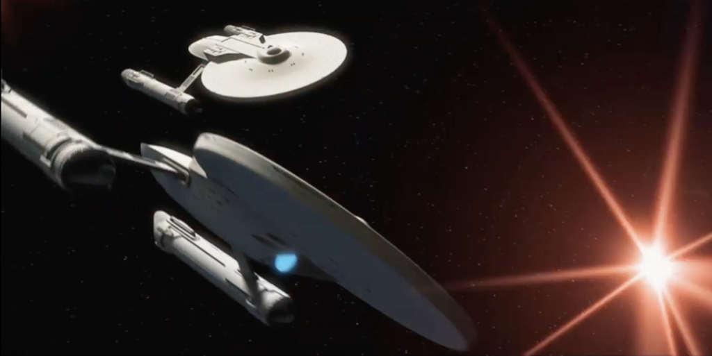
This is the first in a series of three weekly blogs I’ll be posting about the opening VFX sequence for my fan film Interlude and how it went from an idea in my head to looking like this…
When I first set out to raise money to make Interlude, I knew I needed to show something. Obviously, without costumes or a cast, we couldn’t shoot any actual footage. Of course I’d feature the creative people involved, but doesn’t typically create high excitement unless some of those people are Star Trek celebrities (which fan filmmakers can no longer use). So what’s left? Well, VFX, of course!
I spoke to my CGI guy, LEWIS ANDERSON (a pseudonym my friend is using) and asked if he’d be willing to churn out a quick visual effects sequence from my script to show what Interlude might look like. “Sure,” he said. “Shoot me over the script, and let me take a look at what you’re thinking.”
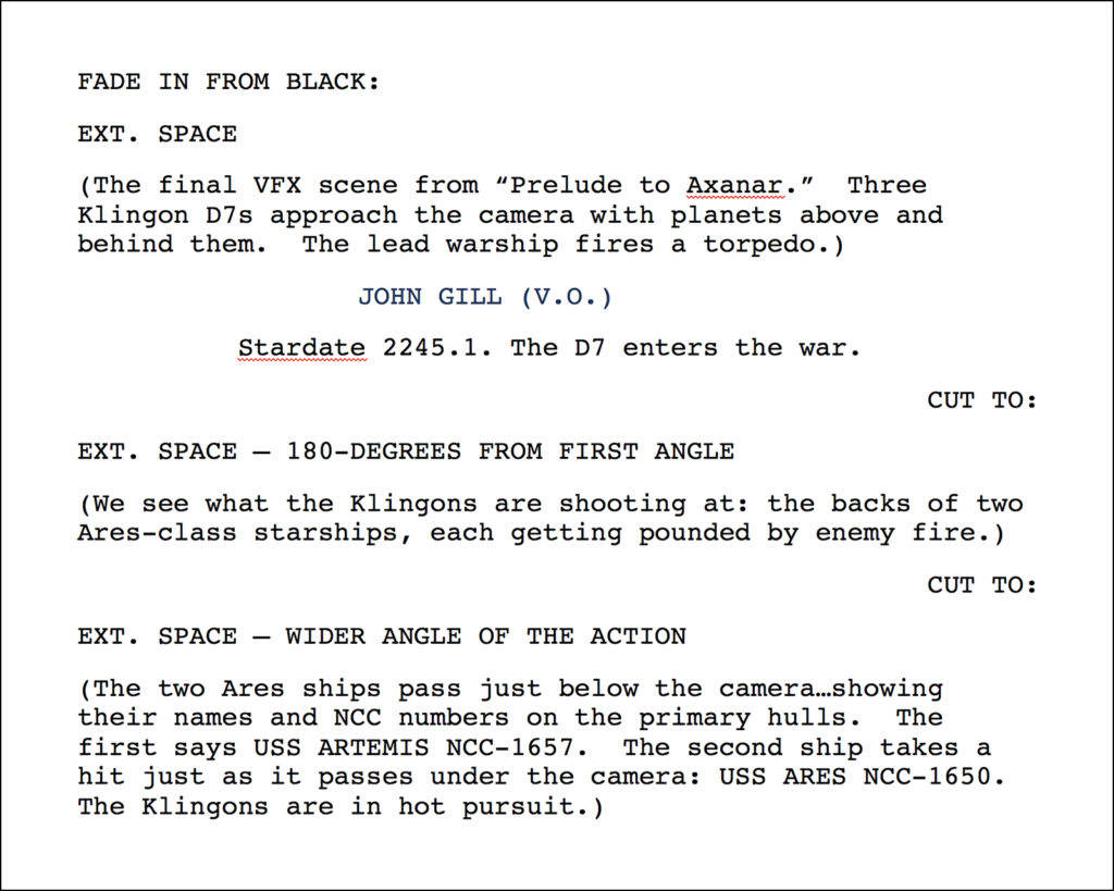
Easy-peasy. I sent him the full script, but highlighted the opening scene…
After receiving it, Lewis messaged me back: “Shouldn’t be a problem, Jon. Do you have anything storyboarded?”
As a matter of fact, I did! I actually had FOUR different storyboards!!!
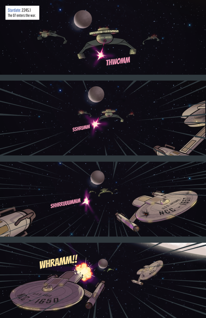
The first wasn’t actually a storyboard so much as a more detailed description of the sequence that I had written up for my comic book artist, DANIEL FU, when I decided (a year earlier) to turn this script into a one-shot AXANAR comic book called “Stardate 2245.1” . The description I wrote up for Daniel was divided into three comic book panels and looked like this…
PAGE 1 – PANEL ONE

The reverse angle of what was on the cover.  We’re viewing the aft (back) of the central D7, a one-point perspective shot.  In the upper two corners are the “heads” and part of the “necks” of the other two Klingon cruisers…same one-point perspective.  On the bottom, small in the distance, are two Ares-class cruisers speeding away.  The one on the right is slightly farther away and therefore slightly smaller.  Their motion lines come in the same one-point perspective from the bottom.  Show a red disruptor blast shooting from the lead D7 towards the closer starship.

Text caption box:
   “Stardate 2245.1 – The D7 enters the war.”


PAGE 1 – PANEL TWO

On the left: a close up on the primary hull of the USS ARTEMIS, an Ares-class cruiser, NCC-1657.  It’s passing right under our eye-line.  The ship is speeding forward.  On the right, slightly farther away so that the entire hull and ship can be seen, is the USS ARES.  We can’t read its name and NCC number yet.  The Klingon warships aren’t visible in this panel, but we can see the red glow on the upper right…headed directly for the farther-away vessel.


PAGE 1 – PANEL THREE

Almost a mirror of panel two, but ARTEMIS has passed completely out of frame leaving the left side empty.  On the right, we can now see the primary hull of the USS ARES, NCC-1650, passing under our eye-line.  The red disruptor blast has now impacted, and there is a small explosion toward the rear of the spacecraft.


A MOCK-UP is shown on the following page only as a VERY ROUGH guide to show what’s in my head.  Feel free to play with angles, positioning, and layout.  I used your ARES drawings from “Trial By Fire” because they were convenient and I can’t draw.  However, I would like to request that the panels with the two Starfleet vessels up close show them coming a little more directly toward the reader rather than pointing as far off to the left or right as appears in the mock-up on the next page…
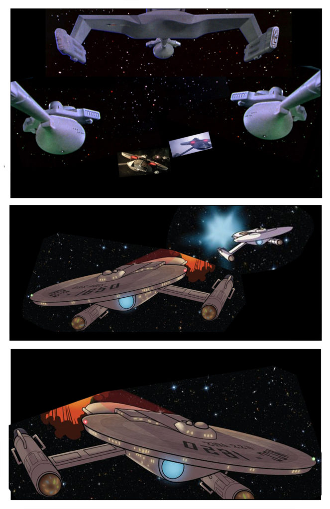
The mock-up I’m referring to in that last paragraph was my feeble attempt to visually communicate what was in my mind. Yes, a picture says a thousand words, but who says you can’t use both? So having a very limited drawing ability myself (“Dammit, Jim, I’m a graphic designer, not an illustrator!”) I used whatever I could find to cobble together a poor man’s visual guide for my artist. Amusingly, I used his own drawings from one of the previous Axanar comics because I didn’t have any other images of the USS Ares at that angle. Here’s what I sent to Daniel…
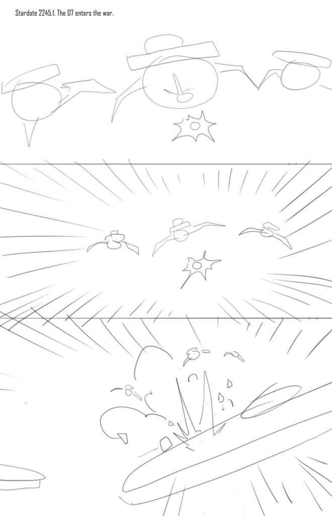
Daniel and I ended up working very collaboratively. I welcomed his input and feedback an as experienced artist, and he was happy to provide it. The first thing he suggested was turn the first panel point-of-view 180-degrees and just come from the cover image (which was the three D7s from the last scene of PRELUDE TO AXANAR) and slowly zoom out to show what they’re shooting at. He drew up a quick rough sketch…
Cool! I requested he go from three panels to four so that each ship, the Artemis and the Ares, could have its own close-up of the name on its hull as it passes under the “camera.” What we ended up with was the following awesome page of artwork (and don’t get me started on how long it took us to come up with the written versions of the sound effects!)…
So between the written panel descriptions, my poor-man’s mock-up, Daniel’s rough sketch, and the final page artwork, I had four different storyboards to send to Lewis.
It was more than he needed, of course, but certainly enough to get started. I’d already managed to get him CGI models of the USS Ares and the Klingon D7, although he needed to do some extra homework creating a USS Artemis primary hull name and NCC number.
The next step was what is called previs (short for previsualization). These are low-detail CGI animations that can be rendered quickly by a computer. There’s no complex lighting yet or detail…just simple motion of the objects in the shot that can be redone without much render time if they come out wrong.
What I found fascinating were Lewis’ and Daniel’s very different visual approaches to the sequence. While Daniel had considered the compositional presentation of the entire page and resisted including the “reverse angle” of looking at the backs of all of the ships, Lewis has the opposite opinion. He definitely wanted to show the reverse angle and, in fact, strongly suggested three different shots in the sequence rather than just one where we start with the Klingons and pull back to reveal the two Ares-class cruisers.
“If we just zoom out, It’ll end up looking like they’re all going backwards,” he told me. “And this is an exciting space battle. You want quick cuts, not long-duration shots.” I trusted my friend; he does this stuff professionally. So I told him to tackle it in whatever way he thought worked best. A few days later, Lewis uploaded the following three shots for me to look at (obviously, there was no sound yet)…
I remember the first sound I made being a sort of “squeak!” of excitement. Now, I realize that Lewis did all of the work on this. All I did was describe things while he made it all look AWESOME. But I still felt a total rush in seeing the first seconds of my fan film suddenly become real…even if they were just simplified models with no fancy texture-mapping or all that other magical 3D stuff.
That said, I still had some creative feedback. While I’m sure Lewis would have preferred to just render the final version and move on with his (paying) life, he encouraged me to tell him what I liked and didn’t like. As his “client,” he wanted me to be 100% happy and not settle for something I only thought was just okay.
My first bit of feedback was the transition between shot one, which ended with the “head” of the D7 passing over and shot two, which began abruptly just behind the bridge above the head. The jump seemed abrupt. Maybe we could extend shot one just a little to allow the camera to turn as it watched the Klingon go past?
Also, I thought the two Ares-class ships doing barrel rolls seemed a little too playful. How about they don’t go completely upside down and instead try to reestablish their orientation? (And yes, I know there is no “up” in outer space!)
And finally, in shot three, we needed to see the top of the USS Artemis hull in order to read the name. Right now, we were only seeing the bottom of the ship.
Lewis was fine with everything, and he quickly made the adjustments to all three shots…
Better. I definitely liked the end of shot two more (without the full barrel rolls), and we could now see the top of Artemis in shot three. But there were still some things that didn’t work for me. Lewis was fine making more changes if needed.
The first thing we discussed was the transition from the end of shot one to the beginning of shot two. It was worse after my suggestion…and I suspect Lewis knew it would be and did it anyway so I could discover for myself. (Yeah, Lewis, I’m on to you!)
But I wasn’t giving up quite yet. If I was going to be wrong, I wanted to be thoroughly wrong! I asked if there might be a way to combine shots one and two and make them a single, uninterrupted sequence. My mind went to that beautiful D7 camera-flyover from the beginning of Star Trek: The Motion Picture.
“Um, no, Jon,” he said politely, “it’s NOT going to look like that. It’s going to be much worse because we’ll have to come around the neck and suddenly rise up above it. I’ll show you.”
And he did…
Yuck! Okay, totally wrong. I get it now. But I did have one other idea to end shot one without any kind of fly-over. I had begun to suspect that it was the fly-over that was bothering me because shot two started just behind the bridge while shot one ended under the head. Why not go “through” the head???
I’ll admit, part of me thought the idea was crazy: have the camera go right INTO the Klingon torpedo tube! But I don’t think that had ever been done before in any Star Trek episode, movie, or fan film. So why not at least try it?
The next morning, I woke up to this…
WOW! Sold! That immediately became my favorite moment in the entire sequence. So I quickly edited it together with the next shot to see how they worked together…
Hmmm….close. But I felt that the camera being slightly to the side in shot 2 made it feel a little like a “bounce.” If we were now going direct into the head of the D7, then let’s come out the back, just behind (not to the side of) the bridge deck.
By the way, I should mention that did indeed ask Lewis if I was driving him crazy with all of the tweaks. And, yes, I was. BUT! He assured me that he wanted me to be totally satisfied and did not mind making these tweaks. (He said he’s dealt with much fussier people than me.)
Lewis shifted the camera slightly to fly over the center of the D7 (rather than the side). It was a small change, barely noticeable, but I felt that it made a significant difference…
Perfect!
Now it was time to tackle shot three. The most important element for this shot had to be the ability for the viewer to clearly read the names and NCC numbers of both ships. That’s actually not as easy as you might think in Star Trek, as the name pretty much only appears large and clearly in one place: the top of the primary hull. And therefore, to read the name, the camera is limited in where it can be placed, and the ship is limited in how far away it can be.
In the previous version of shot three (second video down under the comic book page if you want to rewatch it), I felt the ships were too far away to read the names on their hulls. So Lewis gave me a version moving them both closer to the camera…
It really wasn’t working for me, and Lewis suggested that we Skype to discuss things further. As a graphic designer by trade and training, I hate it when my own clients say to me: “No, that’s not it. Come up with something else, and I’ll let you know when it’s right.” I was NOT going to do that to Lewis. I wanted to give him specific feedback of why it wasn’t working for me and what I was looking for instead.
My first bit of feedback was the angle. With the ships flying left to right, the orientation of the names would be sideways and potentially harder to read. Was there a way for the ships to fly top to bottom? The answer was “yes,” but they’d be on the screen for less time, especially in wide screen format. There’s simply less distance from top to bottom than there is side to side. But Lewis had some ideas about flying slightly diagonally and toward the camera, and also panning down slightly, increasing our screen time for the hull.
The other issue I had was harder to put into words. After this opening sequence, the scene shifts to the bridge of the USS Ares. Although we see the Ares last in shot three, it’s farther away than the Artemis. I felt as though I wanted the camera to end up closer to the Ares. sexe24
And that’s when I began doing what, I am told, countless clients have done with their 3D guys: I began waving my arms and hands while making swishing noises. But Lewis got it. I wanted both ships to be coming toward the camera, and I wanted the Ares to almost literally “crash” directly into the screen…kind of like we’d done with the Klingon in shot one. This would set us up perfectly the cut to the bridge scene next.
The following day, I received this…
Man, this was sooooooo close!
Anyone remember how Peter Falk as Detective Columbo would say, “Uh, just one more thing…” I asked Lewis of it were possible to hold on the primary hull of the Artemis just a teensy bit longer? I wanted to give the audience as much time as possible to read the name. Thank heaven for Lewis’ infinite patience! A short time later, I received what would be the final and perfect previs…
And just like that, we were done!
Well…almost done. Lewis still had to render out the final animation. He finessed the lighting, added motion blur and shield effects, and probably a whole bunch of other wizardry I can’t even fathom. All I know is that, a couple of days later, I had this CGI masterpiece waiting for me…
Now we needed to add some sound, and that meant it was time for MARK EDWARD LEWIS to add sound FX and KEVIN CROXTON to compose some music. But which comes first?

“He said he’s dealt with much fussier people than me…I began waving my arms and hands while making swishing noises.”
I love it.
And I appreciate the view into what it takes to make even a few seconds of final product. Too often I find people, including myself, pass judgement on something we’ve seen without knowing what it took to get to that product. I might still not agree, but I have more sympathy knowing what those involved in the process went through.
I appreciate that, Jerry.
It’s easy to criticize and detract. Some people dedicate quite a bit of time to it, as a matter of fact! I prefer to put my efforts into more positive, creative pursuits that build things up rather than tear them down. That’s why I refuse to criticize any fan film, even if it’s obvious that this or that was done wrong or badly. With most fan films, finding faults and problems is like shooting fish in a soup bowl. But even the worst fan film out there took time, effort, and dedication to make…and that should be acknowledged and honored…at least in my opinion.
Dang! Lots of work for Lewis for just those few seconds. Kinda reminds me of when we added onto our new house (before moving in) with me using a simple program (3-D Home Architect) to lay out floorplans to show our carpenter. (NOT a real architect with measured plans or anything mind you, but just floor plans.) I was on version 50- before the carpenter got it and the on-paper “final” was # 53 after talking to him. Then there were all the changes when I came on-site and as saw that my vision on paper didn’t match the reality. “Uh, guys? There’s something we need to talk about…” ..especially the day they had to move a window or two. LOL I think they came to shudder when I stopped by to see the progress. Count your blessings your version is “just” on the computer.
Dang! The hours of work ahead for you guys is mind-boggling. I’m so hoping this gets funded. I’m really looking forward to it. Good luck!
Wait till you read the next two blogs! 🙂
Really interesting read, your vfx man is one easy going guy 🙂 I loved the ships were shot in Prelude, with a bit of luck Interlude will offer more of the same.
Are your directors going to handle actors only or will they be involved in the vfx too?
Excellent question!
Victoria will be the primary director for the actors. Joshua will “paint with light” (as he calls it) and handle much of the technical aspects of shooting. But when it comes to post-production, I’m not certain yet. Both of my directors are very busy professionals, but they also want to make sure this is a quality film. If you’ve watched any of their Avalon Universe fan films, you’ll see they put a lot of time, effort, and attention into post-production, sound, editing, music, and VFX. For their films, thus far, they’ve dealt mainly with the monarch of models (CGI models, that is), Samuel Cockings…with fantastic results. But Lewis is my friend, so I suspect we’ll kinda tag-team together, and hopefully things will go smoothly. Lewis, as you’ve seen, is pretty patient. Granted, I don’t want to push it, but he’s really psyched about doing more VFX for this project. So please continue to donate and spread the link:
https://www.gofundme.com/interlude
Another $100 donation came in earlier today!