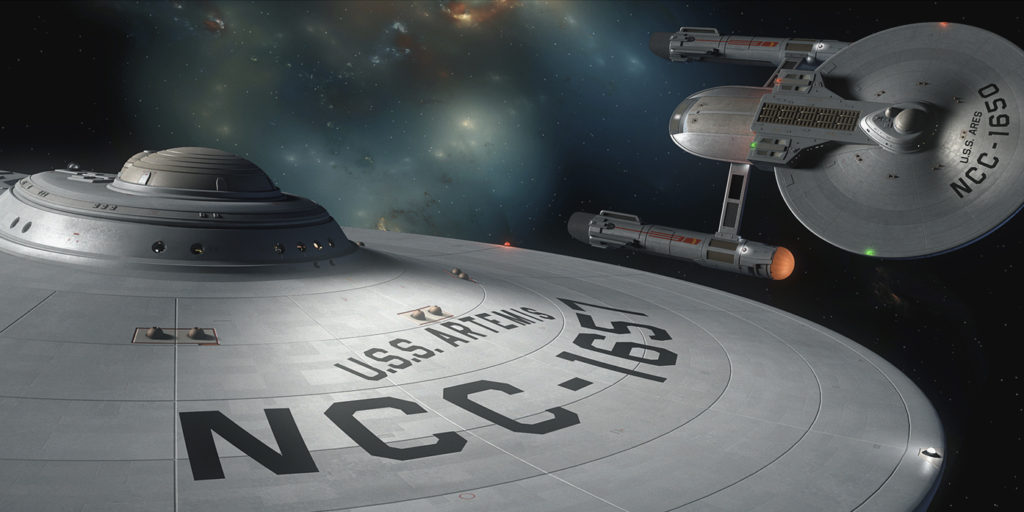
It’s time for another look behind the INTERLUDE curtain, my friends! Last week, I showed you the secret origin of the photo of the Golden Gate Bridge that will appear behind Admiral Slater for about 20 seconds at the end of the fan film. This week, I’m going to shine the spotlight on how we came up with the ship’s logo for the USS Artemis. The process was much more involved than I thought it would be!
Our story begins over a year ago before Interlude was ever going to be a fan FILM and was simply going to be a fan COMIC BOOK. It was time for my illustrator, the amazingly talented DANIEL FU, to draw Captain Imari Jakande of the USS Artemis for the first time, and he needed to know what kind of insignia to put on his chest.
Hmmm…
By this point, three of the Ares-class starships had logos designed for them: Ajax, Ares, and Hercules:
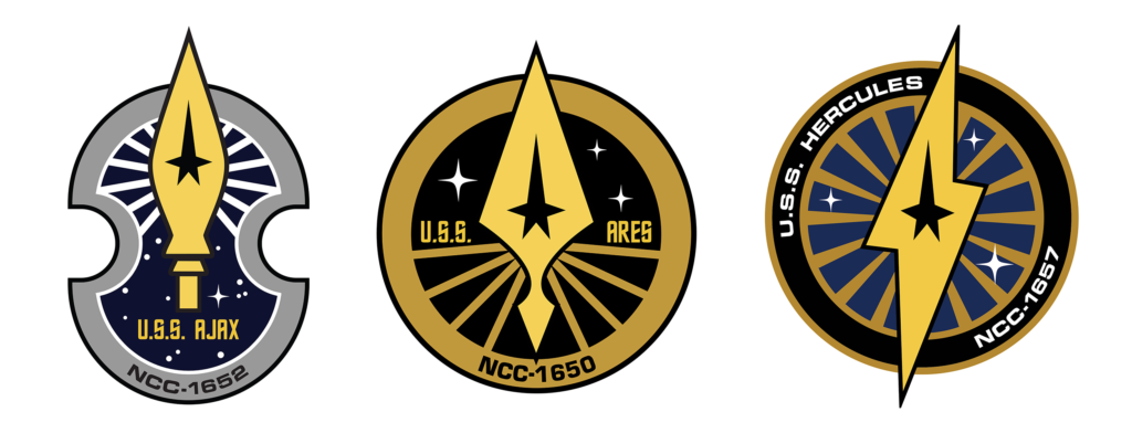
They each featured some kind of weapon (I consider a lightning bolt thrown by a super-strong demi-god to be a weapon). So what kind of weapon was Artemis known for? Well, as goddess of the hunt, she was often depicted with a bow and arrow. The problem was, bows and arrows are very thin and don’t typically have enough room to fit a command star symbol in the center…let alone a sciences planet or an engineering comet.
But Daniel did a little research to discover that Artemis was also the goddess of the moon. Sure, the moon isn’t a weapon (usually), but it’s still a nice celestial outer space thingie. So I gave Daniel a green light to do a moonish insignia. Here’s what he came up with:
As I said, this was long before Interlude the fan film became a possibility. But once it did, I realized that we were going to need an insignia for the USS Artemis tunics in the film…and suddenly there was a problem again. (Isn’t there always in these blogs?)
Continue reading “INTERLUDE update: logos and patches and plaques, oh my!”