As usual, a quick check on the GoFundMe campaign. While donations have slowed, they’re still coming in and inching us closer to our $19,500 goal. Right now, we’re 45.3% of the way there and 118 donors, with some promotional pushes planned over the next couple of weeks. Fingers crossed!
In the meantime, if you haven’t donated yet, have a little extra to spare at the moment, or simply want to help us spread the word, here’s the link…
https://www.gofundme.com/interlude
And now, the blog…
SPOILER ALERT!
The spoiler warning is there to remind you that this short comic book story is pretty much identical to what you’ll see in INTERLUDE when it’s finished…only the comic is two-dimensional drawings without sound or motion or all the other cool stuff you see in fan films.
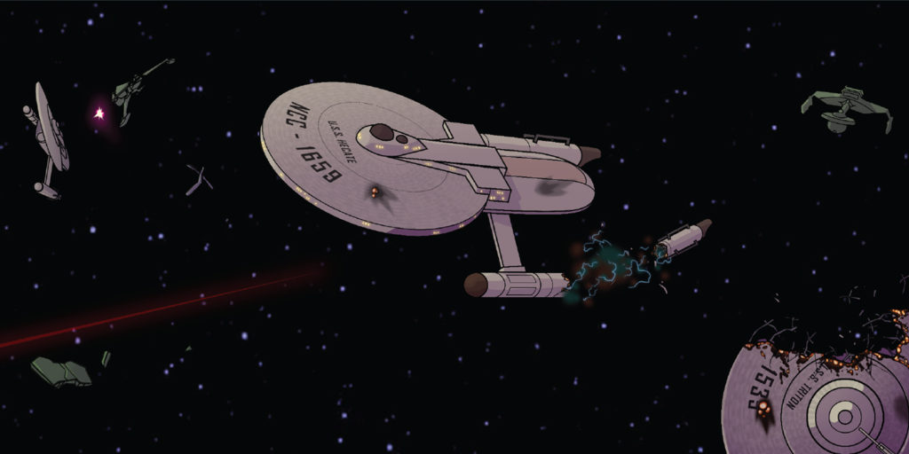
Interestingly enough, we’ve reached the point where I need to start being very selective in choosing which panel(s) to show at the top of the blog entry. I always like to show some thumbnail, as it increases the visibility of the link when I post to Facebook and Twitter. Also, if I don’t set the thumbnail, Facebook and Twitter will use their mysterious algorithm to decide for themselves with thumbnail to use…and that could inadvertently end up giving away an important spoiler.
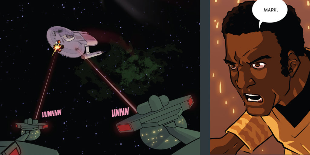
So as you can see from the image at the top, I’ve chosen something very ambiguous to display while still showing off the amazing artwork of my illustrator DANIEL FU.
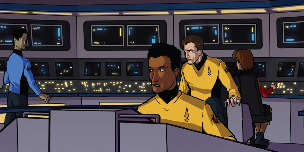
And speaking of Daniel, I’d like to take a moment to point out something that many of you might not have noticed. Sure, his art looks awesome…with great composition that moves the eye around the page, dramatic expressions and poses, confident line work, and contoured contrasts of light and shadow.
But did you notice the colors? I mean, they’re bright and vibrant and all, which is important for this era of Star Trek (before things got darker and less saturated in the later TV series like Discovery and Enterprise). But it’s more than just that.
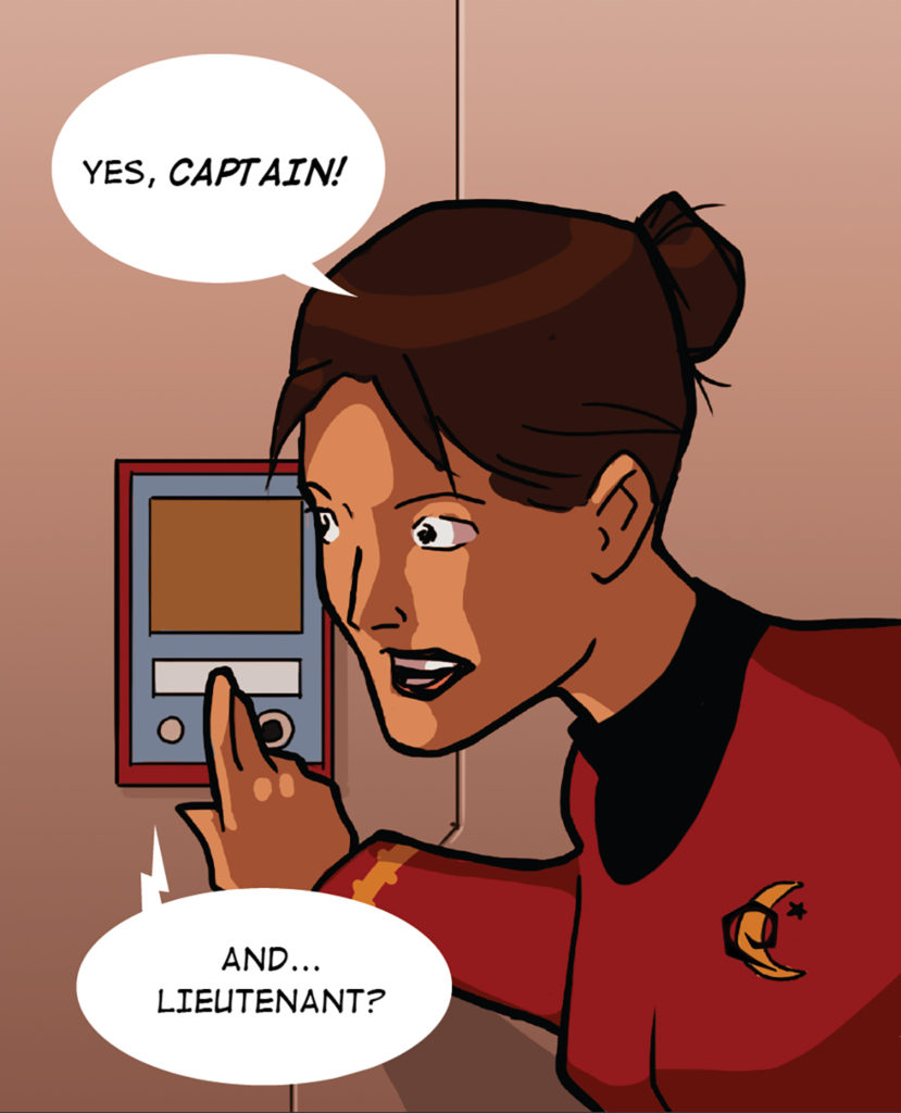
When Daniel and I discussed the story and pages, I art directed him that I felt it was important to distinguish the two bridges—Ares and Artemis—which are, of course, identical. And they’re both at red alert, meaning they both should be colored to reflect that emergency battle status. So how could Daniel make two identical bridges, both tinged red for battle status, look different?
Continue reading “Just posted: PAGE 4 of the INTERLUDE comic “STARDATE 2245.1”!”

